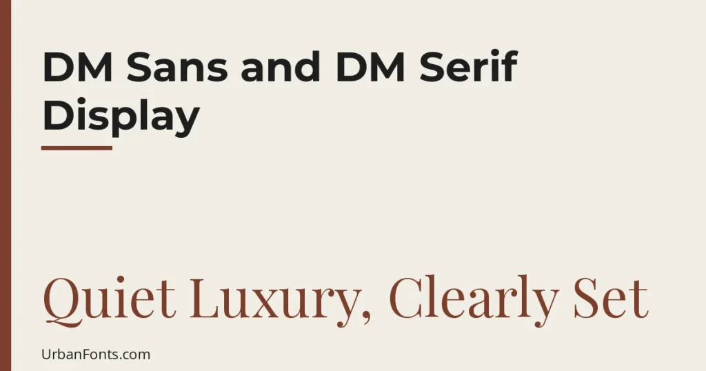
If you are looking at Google Fonts DM Sans DM Serif Display as a pairing, the short version is this: use DM Serif Display for large headlines and DM Sans for everything else. Both come from Colophon Foundry, both are free under the SIL Open Font License, and they sit together well because one is a sharp, high-contrast serif and the other is a calm, low-contrast geometric sans. This guide covers the facts, how to load them on a website, how to use them in Canva, and where the pairing fits.
What each font is
DM Sans is a low-contrast geometric sans-serif. The project’s own repository says it is derived from Poppins, and it was commissioned from Colophon Foundry with creative direction from MultiAdaptor and the DeepMind team. It keeps the geometric shapes but is drawn with low contrast, which makes it a comfortable choice for interface text, captions, and paragraphs.
DM Serif Display is a high-contrast serif for large sizes. It is derived from Source Serif (originally Adobe’s Source Serif Pro), and tuned as a display design for large sizes. The fine, high-contrast strokes that look sharp in a headline become fragile in small text, which is why it is meant for headings only.
| DM Sans | DM Serif Display | |
|---|---|---|
| Style | Geometric sans-serif, low contrast | Serif, high contrast |
| Designer | Colophon Foundry | Colophon Foundry |
| License | SIL Open Font License | SIL Open Font License |
| Weights | Variable, 100 to 1000, plus italics | Regular (400) and Italic only |
| Extra axis | Optical size, 9 to 40 | None |
| Best size | Small to medium | Large (headlines) |
| Language support on Google Fonts | Latin and Latin Extended | Latin and Latin Extended |
You can check the current details on the official DM Sans and DM Serif Display pages. Google updates families, and the weight range on DM Sans is wider than it was in the original 2019 release.
Why this pairing works
- Strong contrast. Serif against sans-serif, thick-and-thin against even strokes. Readers see two clear roles instead of two similar fonts competing.
- Shared origin. Both were drawn by the same studio as one suite, so proportions and finishing feel related. The pairing looks deliberate without being matched.
- Clean division of labor. DM Serif Display has one weight, so it cannot be used for body text or small labels. DM Sans covers that range with a full weight axis.
- Neutral personality. Neither font is trendy or quirky. The design carries a mood through color, photography, and spacing.
The licensing answer
Both families are under the SIL Open Font License. In plain terms you can use them in commercial projects, embed them on websites and in apps, and modify them. You cannot sell the font files by themselves. If you pass copies along, include the license. The Google Fonts license note is the same one that covers other popular open fonts like Playfair Display or Lora.
How to use them on a website
Option 1: the Google Fonts embed
On each font page, choose the styles you need and copy the generated code. A typical result for this pair looks like this.
<link rel="preconnect" href="https://fonts.googleapis.com">
<link rel="preconnect" href="https://fonts.gstatic.com" crossorigin>
<link href="https://fonts.googleapis.com/css2?family=DM+Sans:ital,opsz,wght@0,9..40,100..1000;1,9..40,100..1000&family=DM+Serif+Display:ital@0;1&display=swap" rel="stylesheet">
Then assign them in your CSS.
body { font-family: "DM Sans", system-ui, sans-serif; font-size: 1.0625rem; line-height: 1.6; }
h1, h2 { font-family: "DM Serif Display", Georgia, serif; font-weight: 400; line-height: 1.15; }
Two details matter. First, set font-weight: 400 on headings. Browsers apply bold to h1 and h2 by default, and since DM Serif Display has no bold file the browser would synthesize one. Second, trim the request. If you only need weights 400 and 700 of DM Sans, ask for those instead of the full 100 to 1000 range. The smaller the range, the less data the visitor downloads.
Option 2: self-hosting
Because the license allows it, you can download each family from its Google Fonts page, upload the font files to your own server, and load them with @font-face. Many developers do this for speed control or to avoid third-party requests. Use WOFF2 files for the web, and keep font-display: swap so text appears right away in a fallback font while the file loads.
Optical size
DM Sans has an optical size axis. Browsers apply it automatically when font-optical-sizing is auto, which is the default, so small text gets slightly looser spacing and large text gets tighter, finer forms. You do not have to do anything, but it is worth knowing if you ever lock the axis with font-variation-settings. If you want deeper background on this technology, Google’s variable fonts glossary entry is a good start.
How to use them in Canva
- Open your design and click a text box.
- Click the font name in the top toolbar and type DM Serif Display in the search box. Select it for the headline.
- Click the body text, search DM Sans, and select it. Use the weight options Canva offers rather than the bold button on the serif.
Canva’s font library is updated from time to time, so if either name does not appear in your account, upload the font yourself. Download each family from Google Fonts, unzip it, and follow our guide on how to upload a font to Canva. Uploads usually require a paid plan, so check what yours includes. In Canva, size differences carry more weight than in a web page: try a headline at roughly two to three times the body size, and keep body text at a size you can read on a phone.
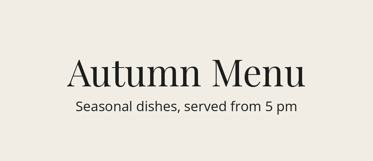
Where the pairing works best
| Use case | Headline | Supporting text | Why it fits |
|---|---|---|---|
| Restaurant or cafe menu | DM Serif Display for dish categories | DM Sans for descriptions and prices | Warm headlines, tidy small print |
| Blog or magazine layout | DM Serif Display for titles | DM Sans for body and captions | Editorial feel with a clean reading column |
| Portfolio website | DM Serif Display for name and project titles | DM Sans for descriptions and navigation | Personality up top, no distraction below |
| Pitch deck | DM Serif Display for slide titles | DM Sans for bullets and numbers | Distinct titles, legible data |
| Event invitation or poster | DM Serif Display, large | DM Sans in small caps style or with spacing | Clear order of information |
It is less suited to designs where you want a very friendly, handwritten, or strongly technical tone. For a quirkier voice, browse our script fonts or keep the serif and swap the sans.
Tips to get the best result
- Keep headline lengths short. A high-contrast serif looks best at two or three lines at most.
- Use DM Sans at 400 or 500 for body text. The lightest weights are better for large, airy captions.
- Use italic sparingly. DM Serif Display Italic is attractive for a single emphasized word, not whole paragraphs.
- Need a serif for paragraphs? Use DM Serif Text, or pair DM Sans with a text serif such as Lora. Our post on what a serif font is explains why text serifs and display serifs differ. See also the wider list of serif fonts.
- Test on a phone. High-contrast hairlines sometimes thin out on low-resolution screens.
Alternatives if this pair is not quite right
If you like the idea but want a different flavor, swap one side. Playfair Display with a neutral sans gives a more dramatic, fashion-style headline. Fraunces has a softer, more variable character. On the sans side, Poppins is the original DM Sans parent and is wider and more strictly geometric. All of these are on Google Fonts under open licenses. Browse a few at elegant fonts to compare.
Frequently asked questions
Are DM Sans and DM Serif Display free for commercial use?
Yes. Both are released under the SIL Open Font License (OFL) and are listed on Google Fonts, so you can use them in commercial websites, print, apps, and client work. You may not sell the font files on their own. Keep the license text with any copies you redistribute.
What weights does DM Serif Display come in?
Only one: Regular (400), plus a matching Italic. If you set font-weight to bold in CSS, the browser fakes a heavier version, which usually looks worse. Leave it at 400 and control emphasis with size and color instead.
Is DM Sans a variable font?
The current Google Fonts version is. It has a weight axis from 100 to 1000 and an optical size axis from 9 to 40, with upright and italic files. Older static copies you may have downloaded years ago had fewer weights.
Can I use DM Sans and DM Serif Display in Canva?
Search for each name in Canva’s font dropdown. Canva’s library has changed over time, so availability can vary. If one is missing and you have a plan that allows custom uploads, download the family from Google Fonts and upload it through your Brand Kit.
What is the difference between DM Serif Display and DM Serif Text?
They are the same design family at different intended sizes. Display has finer, higher-contrast strokes for large headings. DM Serif Text is built for smaller sizes, so it holds up better in paragraphs.