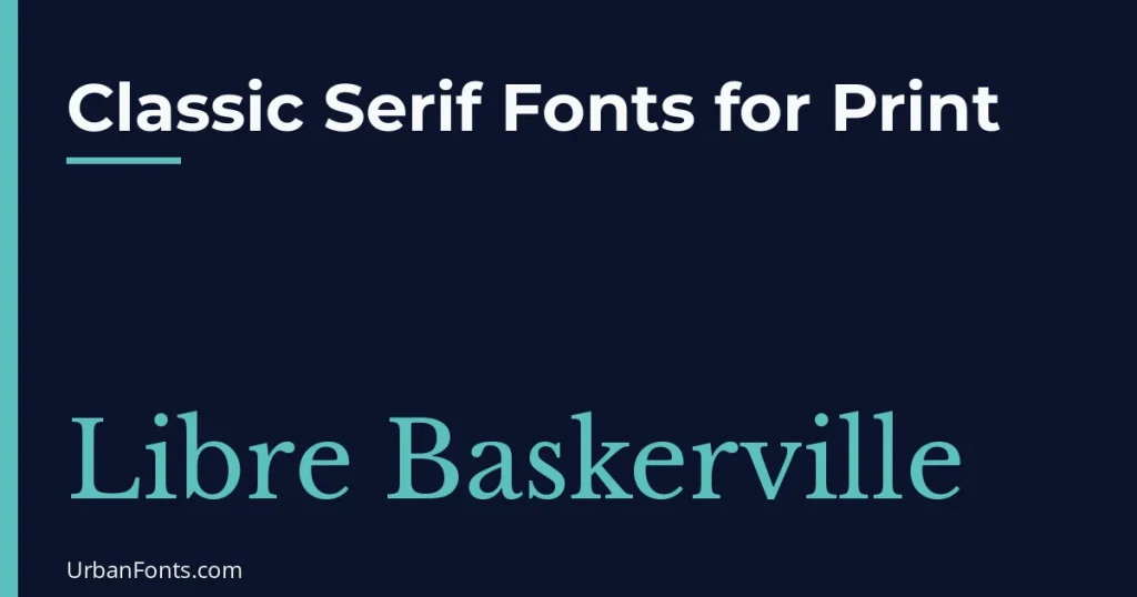
Classic serif fonts for print are the typefaces built on centuries of book and newspaper practice: Garamond, Baskerville, Caslon, Times and Palatino, along with their free open-licensed relatives EB Garamond, Libre Baskerville, Libre Caslon Text, Crimson Pro and Source Serif 4. They stay readable in long passages at 9 to 12 points, which is why books, reports and magazines rely on them. Below is a comparison, the story behind each style, and how to set them well on paper.
Why serifs still work so well in print
On paper, ink and printing resolution are high enough to hold the fine details that serif fonts depend on. The small strokes at the ends of letters help guide the eye along a line, and the variation in stroke thickness creates a rhythm that many readers find comfortable over long stretches. Serifs are not scientifically proven to be better for everyone, but they are the long-standing convention for books and newspapers, and readers expect them. Our guide to serif fonts explains the main categories.
The classic families and what they are known for
- Garamond. Based on 16th-century French types attributed to Claude Garamond. Light, even and elegant. There are many revivals, so “Garamond” on one computer may look different from another.
- Caslon. Designed by William Caslon in London in the early 18th century. Sturdy and slightly uneven in a charming way. Widely used for books and in early American printing.
- Baskerville. By John Baskerville in the 1750s. More contrast and crisper shapes than Caslon, a forerunner of modern faces.
- Times New Roman. Commissioned for The Times of London and released in 1932. Compact, so it fits more words per line. Our post on taking back Times New Roman discusses why it gets a bad reputation.
- Palatino. By Hermann Zapf around 1949. Wide and calligraphic, with a friendly, open look.
- Georgia. By Matthew Carter, released in 1993 for screens. It is sturdy and has distinctive old-style numerals. See our post on typefaces by Matthew Carter.
Times New Roman, Georgia and Palatino ship with Windows or macOS, but that does not make them free to embed or redistribute everywhere. Other classic names such as Adobe Garamond or Monotype Baskerville are commercial. For print jobs, you usually only need to output a PDF with the fonts embedded, which is allowed under typical desktop licenses, but check the license if you are unsure.
Free classic serifs you can use commercially
| Font | Tradition | License | Suits |
|---|---|---|---|
| EB Garamond | Garamond revival, based on historic 16th-century specimens | OFL (Google Fonts) | Books, essays, invitations, literary design |
| Libre Baskerville | Baskerville style, sturdy and open | OFL (Google Fonts) | Reports, brochures, menus |
| Libre Caslon Text | Caslon style, warm and readable | OFL (Google Fonts) | Novels, magazines, certificates |
| Crimson Pro | Old-style book serif | OFL (Google Fonts) | Long text, academic work, ebooks |
| Source Serif 4 | Transitional, with optical sizes | OFL (Google Fonts) | Reports, textbooks, corporate documents |
| Lora | Contemporary serif with calligraphic roots | OFL (Google Fonts) | Magazines, blog-to-print, brand collateral |
| Merriweather | Sturdy and wide, built for screens | OFL (Google Fonts) | Large-print documents, newsletters, handouts |
The SIL Open Font License permits commercial use, including print products you sell, as long as you follow its conditions (such as not selling the font file by itself). The license is listed on each font’s page at Google Fonts.
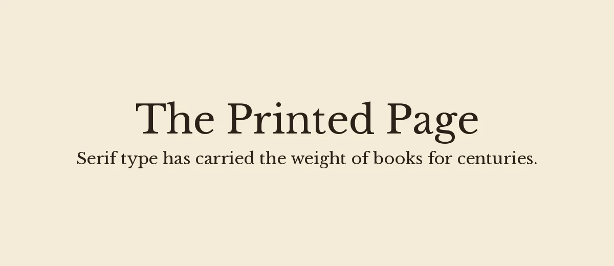
How to set serif type for print
Choose a size and leading
For books and reports, body text of 10 to 12 points is typical. Set the line spacing (leading) at roughly 120 to 145 percent of the font size, so 11 point text gets about 14 to 15 point leading. Wider lines need more leading. Large-print material may go to 14 points or more.
Keep lines at a comfortable length
Aim for around 45 to 75 characters per line. Longer lines make it hard to find the start of the next one. If your page is wide, use columns or larger margins.
Use the right details
- Ligatures and kerning. Turn them on in your layout software for text fonts.
- Old-style numerals. They blend into text better. Use lining numerals in tables and invoices.
- Small caps. Real small caps, when the font supplies them, look better than shrunken capitals.
- Italics and bold. Use the font’s real italic and bold, not a faked slant or smear.
- Hyphenation and justification. Justified text needs hyphenation turned on and a decent column width, otherwise you will see gaps between words.
Prepare files for the printer
- Export a PDF and choose the option to embed all fonts. Printers prefer PDF/X formats.
- Check the preflight report for missing or substituted fonts.
- Print a proof on the real paper. Fine hairlines and small text can look different on uncoated stock, and ink can spread slightly into the paper.
- For very thin type or reversed text (light on dark), choose a sturdier weight.
Pairing a classic serif with other fonts
A classic serif is most useful in text, so spend your pairing decisions on the supporting roles: headings, captions, page numbers and tables.
- Serif body with a sans for captions and tables. Source Sans 3 or Montserrat give a crisp contrast and stay legible at small sizes.
- Same family, different styles. Using the roman for text, italic for emphasis, and small caps for running heads gives a cohesive look with nothing extra to manage.
- A display serif for titles. A large title in Playfair Display over EB Garamond body text looks natural because both come from the old-style and transitional traditions.
Print and screen are different
A font that looks great in a printed book may look thin on a screen, and the reverse is also true. Georgia, Merriweather and Source Serif were designed with screens in mind, so they hold up well in a PDF that people will read on a phone. Garamond-style faces are lighter and shine on paper. If your document will be read both ways, test it on both, or choose a middle-ground face like Libre Baskerville or Lora.
For more ideas, look through our vintage fonts and serif fonts sections, and read Google’s Fonts Knowledge library for background on choosing type.
Which classic serif should you use?
- Novels and long reading: EB Garamond, Libre Caslon Text or Crimson Pro.
- Business reports and brochures: Libre Baskerville or Source Serif 4.
- Menus, invitations and certificates: EB Garamond with italics, or Libre Baskerville.
- Newsletters and handouts: Merriweather, which reads clearly at larger sizes.
- Magazine layouts: Lora for body, paired with a clean sans for captions.
Frequently asked questions
What is the most readable serif font for print?
Garamond-style and Caslon-style old-style serifs such as EB Garamond and Libre Caslon Text, along with Baskerville and Source Serif, are widely used for long text. The best choice depends on page size, paper and the amount of text.
What font size is best for printed body text?
For books and reports, 10 to 12 points is typical, with leading around 120 to 145 percent of the size. Use larger sizes for large-print or older readers.
Are classic serif fonts free to use in print?
Open-licensed ones such as EB Garamond, Libre Baskerville and Crimson Pro are free for commercial print under the SIL Open Font License. Fonts like Adobe Garamond or Monotype Baskerville are commercial products, so check their license.
Should I use Times New Roman for print?
It is a valid choice, especially where a document must look standard or fit many words on a page. For books and brochures, many designers prefer fonts with more refined text shapes such as Garamond or Source Serif.