The easiest fonts to write by hand are simple print styles with open, round letters, one even stroke thickness, and no joins: Andika, Patrick Hand, Schoolbell, Comic Neue, and the rounded sans-serifs Quicksand and Nunito. Those shapes break each letter into a few basic strokes you can repeat, which is why they work as models for practice, lettering, and worksheets. This guide explains what makes a style easy to copy, which free fonts qualify, and how to turn them into a short practice routine.
What makes a letter style easy to copy by hand
Some typefaces are drawn for screens or printing presses, and their shapes depend on tools a pen does not have. A style is easy to copy when it:
- Uses a single stroke weight. Monoline letters need no pressure changes. A ballpoint, a felt-tip, or a pencil can all do it.
- Has open, simple shapes. A single-story a (like a circle with a stick) and a simple g take fewer strokes than the double-story versions.
- Keeps letters separate. You can stop and lift the pen between letters, which helps with control.
- Has clear differences between look-alike letters. A lowercase b, d, p, and q should be easy to tell apart, and capital I and lowercase l should differ.
- Avoids fine details. Hairline serifs, swashes, and extreme contrast between thick and thin strokes are hard to copy cleanly.
Easy fonts to copy, with notes
| Font | Style | Why it is easy |
|---|---|---|
| Andika | Clear sans-serif print | Designed by SIL for literacy and beginning readers, with distinct letter shapes |
| Patrick Hand | Neat hand print | Even strokes, simple letters, easy to match with a felt-tip |
| Schoolbell | Classroom-style print | Casual and forgiving, with imperfection built in |
| Comic Neue | Casual print | Round, open shapes inspired by comic lettering |
| Playpen Sans | Friendly handwritten print | Looks hand-drawn but stays clear and consistent |
| Quicksand | Rounded monoline sans | Geometric and simple, good for neat lettering |
| Nunito | Rounded sans | Soft, simple letterforms for copying capitals and lowercase |
| Atkinson Hyperlegible | Highly legible sans | Designed to make letters easy to tell apart |
All eight are Google Fonts families under open licenses. You can look through them on the official pages for Andika and Patrick Hand. For more rounded options, browse our rounded fonts, and see handwritten fonts for styles that look more like a pen.
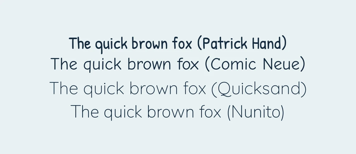
Which one should you start with?
- Total beginner or a child: Andika or Patrick Hand. The letters are clear and the shapes are the ones taught in most print handwriting models.
- Wanting a neat, modern hand: Quicksand. It is geometric, so your practice will be about consistency of circles and straight lines.
- Wanting a casual, personal hand: Schoolbell or Playpen Sans. They give you permission to be a bit uneven.
- Struggling with look-alike letters: Atkinson Hyperlegible, which was designed to help readers distinguish similar characters.
A note on fonts versus handwriting models
Schools teach handwriting from models such as Zaner-Bloser, D’Nealian, or local systems, which define how each letter is built. A font is a finished shape, not a lesson. It tells you what the end result looks like but not the direction or order of the strokes. If you are learning or helping a child learn, use a model from your school or a worksheet from a trusted teacher for stroke order, and use a font as an extra visual reference.
A 15-minute practice routine
- Choose one font and one pen. A 0.5 mm felt-tip or a soft pencil is forgiving. Pick a font from the table above and stay with it for a week.
- Print the alphabet large. Make each letter about 2 cm tall so you can see its construction.
- Trace first. Use tracing paper or print the letters in light gray and trace them. Think about how the stroke starts and stops.
- Copy in groups. Practice similar letters together, as shown in the table below.
- Write words, then a sentence. A pangram such as “The quick brown fox jumps over the lazy dog” uses every letter.
- Check spacing. Leave the same gap between letters and a slightly wider gap between words.
Letter groups for practice
| Group | Letters | What to focus on |
|---|---|---|
| Round shapes | o, c, a, d, g, q | A smooth circle, closed at the same point each time |
| Straight lines | i, l, t, j, u | Vertical strokes at equal height and angle |
| Arches | n, m, h, r | The curve branching off the stem without a gap |
| Diagonals | v, w, x, y, k, z | Consistent angles and clean points |
| Tall and deep letters | b, f, h, k, g, j, p, y | Keeping ascenders and descenders equal in length |
Make your own tracing worksheet
- Open Google Docs or Word and type your practice text, such as the alphabet or a sentence.
- Set the font to Patrick Hand, Andika, or another pick. In Google Docs open the font menu and choose More fonts to add it. In Word, download and install the font first.
- Increase the size to 48 to 72 pt for large letters.
- Change the text color to light gray so there is room for your pen.
- Add line spacing of about 2.0 and print. For ruled lines, use a lined page template or print on lined paper.
Using easy fonts for lettering
Once your print letters are tidy, you can make them more decorative without learning calligraphy. Three beginner techniques help:
- Faux calligraphy. Write a word in simple script-like letters, then thicken each downstroke by drawing a second line beside it and filling the gap.
- Bounce lettering. Let the letters sit slightly above and below the baseline for a playful look.
- Underline and shadow. A plain underline or a light offset shadow turns plain print into a title.
For script or formal calligraphy, the shapes are harder to copy. Our calligraphy fonts collection is better for inspiration than for beginner practice.
Tips if you are an adult restarting handwriting
- Sit with your forearm resting on the table and hold the pen loosely. A tight grip causes tired hands and shaky lines.
- Write slowly at first. Speed comes after consistency.
- Tilt the paper if it helps your wrist stay comfortable.
- Use paper with lines or a guide sheet underneath so letters keep the same height.
- Practice a little each day instead of for a long time once a week.
If you are copying the look of a font you saw somewhere, try one of the methods in our guide to find a font from an image to identify it first. For writing in everyday documents, a plain serif or sans-serif is usually the better choice, and the serif guide explains the difference.
Frequently asked questions
What is the easiest handwriting style to learn?
Simple print with single-story letters and no joins is the easiest to copy and the quickest to learn. Most school systems start there before moving to cursive. A monoline style, where every stroke has the same thickness, removes the extra challenge of pressure.
Which fonts are easiest to copy by hand?
Fonts with simple, open shapes and even strokes, such as Andika, Patrick Hand, Schoolbell, and the rounded sans-serifs Quicksand and Nunito. Avoid high-contrast serifs and ornate scripts while you are learning.
Can a font help improve my handwriting?
It can serve as a model. Print the font large in light gray, trace it, then copy it freehand. A font does not teach stroke order or pressure, so pair it with a handwriting guide or a teacher if you need more than a style reference.
Are these fonts free to use for worksheets I sell?
The Google Fonts families named here are licensed under the SIL Open Font License or Apache License, which allow commercial use, including in printable worksheets. Check the license on any other font before you sell a product.
Should I learn print or cursive first?
Print is a safer first step for most learners, especially adults restarting from scratch, because letters are separate and easier to compare. Cursive can follow once your letter shapes are consistent.