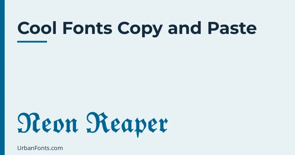
Cool fonts copy and paste means sharp, high-contrast text styles for gamer tags, channel names and bios, such as bold fraktur, double-struck, monospace and squared letters. Type your words into a converter, copy the style you like, and paste it anywhere that accepts text. These are Unicode characters, not installed fonts, so they travel with the text but cannot be changed with a font menu.
Most “cool” lists are just a long dump of every style. This guide is organised differently: what makes a style look cool, which styles suit which job, how to frame them with symbols, and where the whole approach stops working.
What makes text look cool
Three things separate a cool style from a merely decorative one. The first is contrast: thick and thin strokes, or solid shapes against empty space. The second is a hard edge, with angular letterforms instead of round ones. The third is consistency: a name in one style, with one or two matching symbols, looks designed. A name in four styles looks like a mistake.
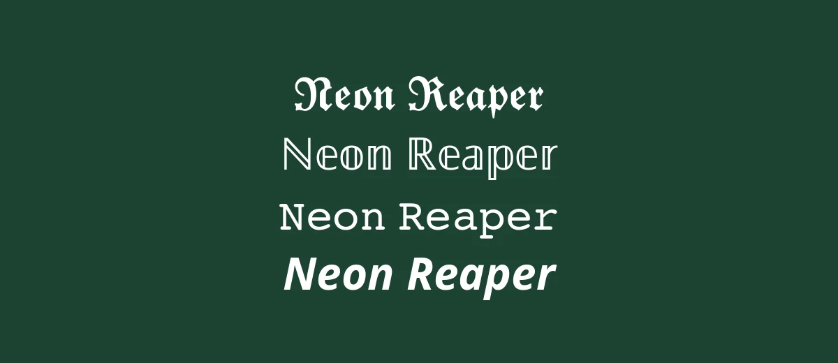
Here are nine styles that meet that test, all generated from the same name.
| Style | Example | Why it works |
|---|---|---|
| Bold fraktur | 𝕹𝖊𝖔𝖓 𝕽𝖊𝖆𝖕𝖊𝖗 | Sharp, gothic edges. The classic gamer-tag look. |
| Double-struck | ℕ𝕖𝕠𝕟 ℝ𝕖𝕒𝕡𝕖𝕣 | Outlined strokes that read as clean and techy. |
| Monospace | 𝙽𝚎𝚘𝚗 𝚁𝚎𝚊𝚙𝚎𝚛 | Terminal and hacker feel. |
| Sans bold italic | 𝙉𝙚𝙤𝙣 𝙍𝙚𝙖𝙥𝙚𝙧 | Fast and aggressive, like a racing logo. |
| Squared | 🄽🄴🄾🄽 🅁🄴🄰🄿🄴🅁 | Blocky, like a label or a keyboard key. |
| Black bubble | 🅝🅔🅞🅝 🅡🅔🅐🅟🅔🅡 | Solid dark tiles. Strong on light backgrounds. |
| Full-width | Neon Reaper | Wide and spaced, with a synthwave feel. |
| Small caps | ɴᴇᴏɴ ʀᴇᴀᴘᴇʀ | Quiet and sharp. Good for a clean, serious tag. |
| Upside down | ɹǝdɐǝɹ uoǝu | A novelty effect. Short phrases only. |
For the full list of 21 alphabets, see our font generator copy and paste guide. This page sticks to the ones that look cool rather than cute or formal.
Pick a style by where it will appear
- Gamer tag or in-game display name: bold fraktur, double-struck or small caps. Games like Minecraft and Roblox limit account usernames to plain letters, numbers and underscores, so check whether the game has a separate display name before you copy anything in.
- YouTube or Twitch channel name: small caps or sans bold. They stay readable in a small thumbnail corner and in notifications. Keep a plain-text name in the channel description so viewers can search for you.
- Discord nickname: almost anything works, but sort-by-name lists put styled names in odd places, because the characters sort apart from plain letters. Moderators also have to read your name, so avoid styles that look like unreadable noise.
- Instagram or TikTok bio: one line in bold fraktur or monospace, then plain text for the useful details. Our guide to what font Instagram uses explains why the app itself always renders text in its own typeface.
Frames and symbols that add edge
A frame turns a styled name into a tag. These are all ordinary Unicode characters, so they paste the same way:
- 『 𝕹𝖊𝖔𝖓 𝕽𝖊𝖆𝖕𝖊𝖗 』
- 【 NEON REAPER 】
- ⚔ ℕ𝕖𝕠𝕟 ℝ𝕖𝕒𝕡𝕖𝕣 ⚔
- ☠ ɴᴇᴏɴ ʀᴇᴀᴘᴇʀ ☠
- ⚡ 𝗡𝗲𝗼𝗻 𝗥𝗲𝗮𝗽𝗲𝗿 ⚡
- ⟦ 𝙽𝚎𝚘𝚗 𝚁𝚎𝚊𝚙𝚎𝚛 ⟧
- ░▒▓ 𝐍𝐞𝐨𝐧 𝐑𝐞𝐚𝐩𝐞𝐫 ▓▒░
The brackets 『 』 and 【 】 come from East Asian typography, where they mark titles and headings, and ⟦ ⟧ is the mathematical white square bracket. ⚔ crossed swords (U+2694), ☠ skull and crossbones (U+2620) and ⚡ high voltage sign (U+26A1) come from Unicode’s symbol blocks. The shaded blocks ░ ▒ ▓ (U+2591 to U+2593) are box-drawing characters and make a quick gradient edge.
Use one frame, not three. If the symbols take up more space than the name, the name stops being the point.
Strikethrough, slash and glitch effects
A separate group of effects works by adding combining marks after each letter instead of swapping the letter. Strikethrough gives N̶e̶o̶n̶ R̶e̶a̶p̶e̶r̶, underline gives N̲e̲o̲n̲ R̲e̲a̲p̲e̲r̲ and a slash gives N̸e̸o̸n̸ R̸e̸a̸p̸e̸r̸. “Glitch” or “zalgo” text piles many marks on each letter so they stack above and below the line.
These are the least dependable effects in this guide. Combining marks can overlap the line above, get clipped by a text box, or be stripped by the platform. Heavy stacking can also make a name unreadable to moderators and to anyone using a screen reader, which may read out every single mark. Strikethrough and underline are fine in small doses. Skip the glitch stacking in any name other people have to read.
How to copy and paste cool text
- Type your name or phrase into a text-style converter.
- Look for the style that matches your use from the table above.
- Copy it with the button, or select it and use Ctrl+C on a computer, or long-press and Copy on a phone.
- Paste it where you want it, then add a frame if you like.
- Check the result on a phone and on a computer. If a style shows empty boxes, that device has no font for it; switch styles.
Where cool text does not work
- Usernames and handles. Most platforms accept only letters, numbers and a few punctuation marks. Styled text works in display names and bios instead.
- Passwords and logins. Never use styled characters here. Many sites reject them, and a password manager or keyboard may not enter them reliably.
- Search. A styled word does not match a plain search. If people need to find you, keep a plain version of the name somewhere visible.
- Accessibility. Screen readers may announce each character by its technical name or skip it. Do not style anything people need to understand.
- Older devices. Squared and black bubble letters are the newest and least supported, and can appear as boxes.
Cool fonts you can actually install
For a logo, a thumbnail, a video title or a poster, install a real font. Text stays editable and searchable, and you control the look. These families are on Google Fonts, which lists them under open-source licences such as the SIL Open Font License, but confirm the licence on each family’s page before using one in a commercial project.
- Orbitron: geometric and futuristic, good for tech and sci-fi.
- Audiowide: rounded, wide and sporty. Suits esports and music.
- Bungee: tall signage-style capitals that work well in thumbnails.
- Russo One: a heavy, squared sans for headlines.
- Press Start 2P: a pixel font that recalls 8-bit arcade games.
- Black Ops One: a stencil look for military and action themes.
More options sit in our headline fonts, gothic fonts and retro fonts collections. If you want the blackletter style from the first row of the table in more depth, read gothic font copy and paste. For a broader menu, try fancy font copy and paste.
Frequently asked questions
What is the coolest font to copy and paste?
For gamer tags, bold fraktur and double-struck are the most common picks, and small caps is the quietest. Cool is subjective, so try your own name in each and choose the one you can still read at a glance.
Can I use cool fonts in my gamer tag?
Only where the game allows it. Many games limit account names to letters, numbers and underscores, while display names, Discord nicknames and bios usually accept styled text. Check the game’s naming rules first.
Why do my cool letters show as boxes?
The device has no installed font containing those characters. Squared and black bubble styles fail most often. Updating the operating system or switching to bold or double-struck usually fixes it.
Are these real fonts?
No. Each letter is a separate Unicode character that looks like a styled version of the original. That is why it pastes anywhere, and also why it cannot be edited with a font menu and may be read oddly by screen readers.