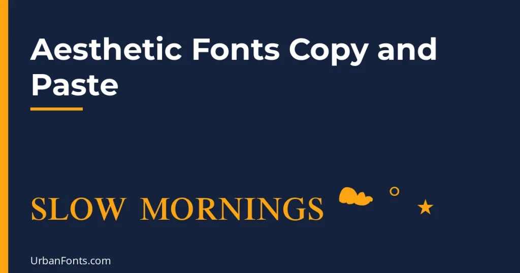
Aesthetic fonts copy and paste is less about one text style and more about a recipe: a Unicode style, a few matching symbols, and the right spacing. Pick the mood first, such as soft, vaporwave, dark academia or minimal, then copy the recipe that goes with it into your bio, caption or chat. Nothing is installed, because the letters are Unicode characters.
“Aesthetic” is a vibe, not a font category, so the same name can look completely different depending on what you put around it. The sections below give you ready recipes, then the rules that keep them looking intentional.
Aesthetic recipes by mood
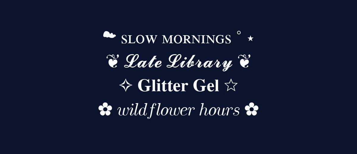
Each row below was built from one text style plus symbols. Replace the words with your own and keep the pattern.
| Mood | Example | Recipe | Fits |
|---|---|---|---|
| Soft and pastel | ☁ sʟᴏᴡ ᴍᴏʀɴɪɴɢs ˚ ⋆ | Small caps, all lowercase, a cloud and one or two small stars | Journals, lifestyle, plant and tea accounts |
| Vaporwave | sunset drive | Full-width letters, nothing else, or add ・ and ♪ | Music, retro gaming, night photography |
| Dark academia | ❦ 𝓛𝓪𝓽𝓮 𝓛𝓲𝓫𝓻𝓪𝓻𝔂 ❦ | Bold script or italic with a floral heart (U+2766) | Books, study, poetry, coffee |
| Cottagecore | ✿ 𝑤𝑖𝑙𝑑𝑓𝑙𝑜𝑤𝑒𝑟 ℎ𝑜𝑢𝑟𝑠 ✿ | Italic lowercase with flowers (✿ ❀ ❁) | Gardening, baking, slow living |
| Y2K and sparkle | ✧ 𝐆𝐥𝐢𝐭𝐭𝐞𝐫 𝐆𝐞𝐥 ☆ | Bold with sparkles and hollow stars | Fashion, nostalgia, fan accounts |
| Minimal | sᴛᴜᴅɪᴏ · ᴘᴏʀᴛʟᴀɴᴅ | Small caps with a plain middle dot (·) | Designers, studios, portfolios |
| Grunge and dark | 𝔐𝔬𝔱𝔥 𝔏𝔦𝔤𝔥𝔱 ✦ | Fraktur with one hard symbol | Music, thrifting, alt style |
If you mainly want sweet, bubbly styles, our cute font copy and paste page goes deeper on that side. For connected-looking script, see cursive font copy and paste.
The rules that make it look aesthetic
Write in lowercase first
Capital letters make text feel formal. Type your phrase in lowercase, then convert it. This works especially well with small caps, where the lowercase input becomes small capitals and the result looks calm and even.
Use one style and two symbols at most
An aesthetic bio looks curated because it has restraint. Choose one Unicode style, repeat one symbol on both sides, and leave the rest of the line plain. Mixing script, fraktur and full-width in a single bio reads as a jumble.
Let the spacing do the work
Short lines with room around them feel gentle. In a bio, put each idea on its own line. Full-width letters add their own spacing, so they need no symbols at all. A plain middle dot (·) or a thin bullet (•) between short phrases is often better than an emoji.
Match the symbol to the mood
The soft marks ˚ and ⋆ suit pastel looks. Hard marks like ✦ and ✧ suit sparkle and Y2K. Floral hearts (❦ ☙ ❧) fit anything bookish or vintage. Pick from one family so they do not fight.
| Symbol | Code point | Official name |
|---|---|---|
| ˚ | U+02DA | ring above |
| ⋆ | U+22C6 | star operator |
| ✦ | U+2726 | black four pointed star |
| ✧ | U+2727 | white four pointed star |
| ❦ | U+2766 | floral heart |
| ✿ | U+273F | black florette |
| · | U+00B7 | middle dot |
Every mark above is a standard Unicode character with its own code point, which is why it pastes the same way as the styled letters.
Three sample bios you can adapt
These show how the rules combine. Each is only a few lines, with the styled part kept short and the practical details left in plain text.
- Soft: ᴘʟᴀɴᴛ ᴍᴏᴍ ☁ ˚ ⋆ / small-batch ceramics / orders open on Fridays
- Dark academia: ❦ 𝓝𝓸𝓽𝓮𝓼 𝓕𝓻𝓸𝓶 𝓽𝓱𝓮 𝓜𝓪𝓻𝓰𝓲𝓷 ❦ / book reviews and handwritten letters / new post every Sunday
- Vaporwave: night drive / synth playlists / link below
In each one, the styled text only labels the mood. The plain lines carry the information that people will search for, such as what you make, when you post and where to find it.
Build your own recipe in four steps
- Name the mood in two words, for example “quiet library” or “neon arcade”.
- Choose one Unicode style to match: small caps for quiet, full-width for retro, bold script for literary, italic for gentle.
- Pick one symbol family and use it once on each side, or once as a divider.
- Preview on a phone in both light and dark mode, then cut anything that makes the line harder to read.
Common mistakes
- Styling everything. A whole bio in small caps or script is tiring to read. Style the label, not the sentence.
- Capital letters in script. Ornate capitals are the hardest characters to recognise. Mixed or lowercase text is easier on the eye.
- Copying from a screenshot or a PDF. Select real text instead, otherwise you may paste spaces or unrelated characters along with the style.
- Forgetting line breaks. Some apps collapse line breaks in a pasted bio. Preview before you save, and use a symbol as a divider if the lines merge.
Where aesthetic text works
- Instagram and TikTok bios and display names. Not the @handle.
- Discord server and channel names. Popular for cozy and themed servers.
- Notes, journal and planner apps. Great for page titles and mood lists.
- Messaging apps. WhatsApp, iMessage and Telegram status lines and group names.
Limits to know before you restyle a profile
- Searchability. People searching for “plant shop” will not find “ᴘʟᴀɴᴛ ꜱʜᴏᴘ”. Keep plain keywords in at least one visible field.
- Screen readers. Many read styled letters by their technical names, or skip them. Do not style contact details or anything important.
- Dark mode and small screens. Thin script can vanish. Small caps and bold hold up better.
- Device differences. Each platform draws these characters with its own system font, so the same text looks slightly different on an iPhone, an Android phone and a laptop.
- Usernames. Most platforms reject them. Use styled text in display fields only.
When you need an aesthetic font for design
For a mood board, a Canva post, a poster or a logo, use a real font, so that the text stays editable and accessible. Free families on Google Fonts that match common aesthetics include Cormorant Garamond for dark academia, Josefin Sans for a thin, minimal look, Playfair Display for high-contrast editorial titles, Quicksand for soft rounded headings and Great Vibes for a formal script. Google lists these under open licences, but check the licence on each page before commercial use.
Browse the minimalist fonts, elegant fonts and vintage fonts collections for more. To use a downloaded font in Canva, follow our steps to upload a font to Canva.
Frequently asked questions
What are aesthetic fonts?
The term has no fixed meaning. It usually describes a styled look that matches a mood such as soft, vaporwave or dark academia. In copy and paste form it is a Unicode text style plus a few matching symbols.
Which Unicode style is the most aesthetic?
Small caps and full-width are the most common choices because they look calm and consistent. Bold script is popular for names. Use lowercase input for the softest effect.
Can I use aesthetic fonts in my Instagram bio?
Yes, in the bio and display name fields. The @username accepts only letters, numbers, periods and underscores, so styled text will not work there.
Are aesthetic copy-and-paste fonts accessible?
Not fully. Screen readers may spell out character names or skip the text. Keep your key information in plain text and use the styled line only for decoration.