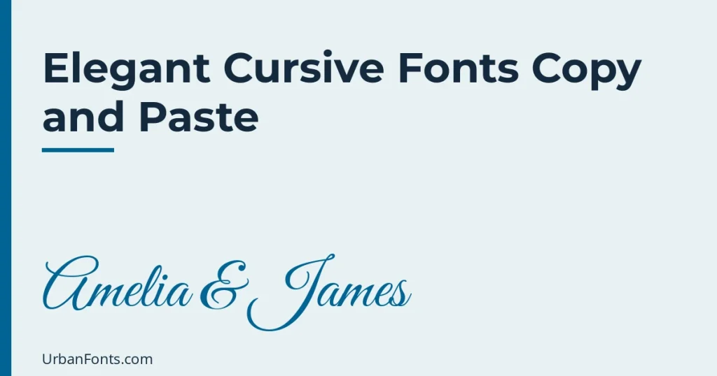
Elegant cursive fonts copy and paste can give names and short lines a graceful, formal look, but only some Unicode styles are worth using, and none of them replace a real script font for invitations. The best choice for a formal look is usually bold script, such as 𝓐𝓶𝓮𝓵𝓲𝓪 & 𝓙𝓪𝓶𝓮𝓼, because it has a complete, even alphabet. This guide shows which styles feel elegant, how to pair them with symbols, and when to switch to an actual wedding or calligraphy font.
What “elegant cursive” means in Unicode
Cursive text generators use the script styles in the Unicode block for Mathematical Alphanumeric Symbols. You can browse them in the official Unicode chart. There are two script styles:
| Style | Example | Character |
|---|---|---|
| Script | ℰ𝓁ℯℊ𝒶𝓃𝓉 ℰ𝓋ℯ𝓃𝒾𝓃ℊ | Thin, light and delicate |
| Bold script | 𝓔𝓵𝓮𝓰𝓪𝓷𝓽 𝓔𝓿𝓮𝓷𝓲𝓷𝓰 | Heavier strokes, more readable |
Which one is more elegant? Choose by where you use it:
- Bold script for most cases. The strokes are heavier, so they survive small sizes and dark backgrounds, and every letter comes from the same part of Unicode, so the alphabet looks consistent.
- Script for a very light, airy look in a large size. It is the more delicate of the two, but a few letters have a catch, described next.
The honest limits of cursive Unicode
Letters do not connect
Real cursive and script fonts join one letter to the next, and good ones use alternate shapes and ligatures so the joins look natural. Unicode script letters are separate characters, each one standing alone. The result looks like decorative lettering, not a flowing signature. For a handwritten effect see the cursive font copy and paste guide.
Some letters come from a different place
Because some script letters were already encoded as symbols, the plain script style borrows a few from the Letterlike Symbols block (for example the lowercase e, g and o, and capitals like B, E, F, H, I, L, M and R). Many fonts draw these slightly differently from the rest, so a word can look uneven on certain devices. Bold script does not have this problem, which is the main reason it is the safer, more elegant pick.
No numbers and little punctuation
There are no script digits. Dates stay in plain numerals: 𝓢𝓪𝓽𝓾𝓻𝓭𝓪𝔂 14.06.2027 will mix styled and plain characters. Ampersands, commas and hyphens also stay plain. That can look fine, and you can control it by keeping dates in a regular font beside your styled names.
Different phones draw it differently
Each device picks its own font for these characters, so Apple, Android and Windows show them with slightly different shapes and weights. You cannot control how it looks, and you cannot choose a “Great Vibes” or “Allura” style. On a very old device the letters may be empty boxes.
Accessibility
Screen readers may announce styled letters as “mathematical script capital A” or skip them, and heavy ornate shapes are harder to read for people with low vision. Do not put essential information, such as an address or a time, in cursive Unicode.
Where elegant cursive copy and paste works
- Social captions and bios for a wedding, bridal brand, florist or photographer. Keep to one line.
- Story and video text where you paste into a text tool that accepts any characters.
- Messaging for a short note such as “𝓦𝓲𝓽𝓱 𝓵𝓸𝓿𝓮”.
- Digital cards and chat invitations for small events, where the message is informal.
Where it does not belong
- Printed invitations and signage. Printers and PDF tools may substitute missing characters, and the lack of true joins is obvious at a large size.
- Logos. A real font gives you a license, consistent shapes and an editable file.
- Usernames, hashtags and website addresses. They need plain letters.
- Legal documents and anything that must be searched.
Making cursive look formal
Elegance is mostly restraint. A few habits help:
- Style names, not sentences. 𝓐𝓶𝓮𝓵𝓲𝓪 & 𝓙𝓪𝓶𝓮𝓼 works. A whole paragraph in script is tiring.
- Use title case. Capitals in script have the most character; all-caps script looks odd.
- Add plain supporting text. Put date, place and details in a simple font below, or plain text in the same post.
- Frame with quiet symbols. Use a single ornament on each side, for example ❦ or ✦, or a thin line such as —.
- Leave space. A short styled line surrounded by white space looks more formal than one packed with emoji.
Symbols that suit a formal look: ❦ ❧ ✦ • ∼ ♡. Skip loud emoji.
Some examples
- ❦ 𝓐𝓶𝓮𝓵𝓲𝓪 & 𝓙𝓪𝓶𝓮𝓼 ❦
- 𝓣𝓸𝓰𝓮𝓽𝓱𝓮𝓻 𝔀𝓲𝓽𝓱 𝓽𝓱𝓮𝓲𝓻 𝓯𝓪𝓶𝓲𝓵𝓲𝓮𝓼
- 𝓣𝓱𝓪𝓷𝓴 𝔂𝓸𝓾 𝓯𝓸𝓻 𝓬𝓮𝓵𝓮𝓫𝓻𝓪𝓽𝓲𝓷𝓰 𝔀𝓲𝓽𝓱 𝓾𝓼
- ✦ 𝓗𝓪𝓹𝓹𝔂 𝓐𝓷𝓷𝓲𝓿𝓮𝓻𝓼𝓪𝓻𝔂 ✦
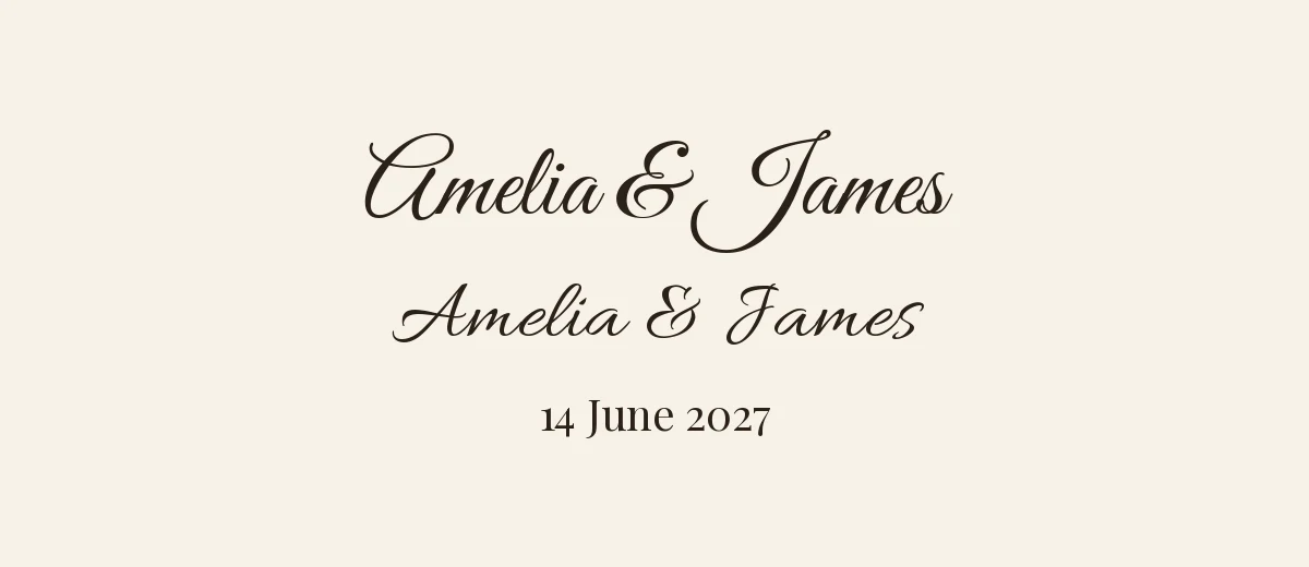
When to use a real cursive font instead
For anything printed or designed, use a script font that has proper joins. Several open-source families on Google Fonts are popular for formal work, and all are published under the SIL Open Font License, which allows commercial use. Check the license note on each page before you download.
| Font | Feel |
|---|---|
| Great Vibes | Flowing and formal, classic wedding style |
| Pinyon Script | Engraved, old-fashioned invitation look |
| Allura | Light and graceful, easy to read |
| Alex Brush | Brush-pen script with a warmer, slightly casual feel |
Pair a script with a calm serif for the details, for example Cormorant Garamond or Playfair Display, and keep the script for names only. Browse wedding fonts, calligraphy fonts and script fonts for more choices. If you design in Canva, uploading a font to Canva lets you use fonts that are not in its library, as long as you hold a license that allows it.
Size, contrast and background
Script letters are thin compared with plain text, so give them room. In a caption or bio you cannot change the size, but you can choose the style that holds up. Bold script is the better choice on a photo, on a dark background or in dark mode, where hairline strokes can fade out. Plain script works best as one large line on a light background, which you can only get in a design app that accepts pasted text, since social apps use one size for the whole caption.
Two more details improve the look. First, keep the styled line short, ideally under five words, because a long script line forces the eye to work. Second, never mix two script styles in the same line. Pairing plain script and bold script looks like a mistake, not a design choice.
A quick workflow for a formal post
- Write your text in plain form and decide which words deserve the script.
- Convert only those words with bold script.
- Paste them in with quiet ornaments and plain details.
- Check the preview on an iPhone and an Android phone if possible.
- For print, recreate it in a real script font.
Frequently asked questions
What is the most elegant cursive text to copy and paste?
Bold script is usually the most elegant choice. It has an even, complete alphabet and holds up at small sizes. Plain script is lighter but borrows a few letters from another Unicode block, which can look uneven.
Can I use elegant cursive copy and paste for wedding invitations?
It is fine for a short social post or a chat message, but not for printed invitations. Printing needs a real script font such as Great Vibes or Pinyon Script, with proper joins and a license that covers the job.
Why do the letters in my cursive text not connect?
Each styled letter is a separate Unicode character, so there are no joining strokes. Only real script fonts can connect letters.
Is cursive Unicode text readable by screen readers?
Often not. Many screen readers read each styled letter as a symbol name or skip it, so keep important details such as dates and addresses in plain text.