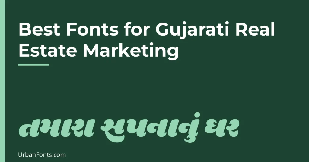
The best fonts for Gujarati real estate marketing are Noto Sans Gujarati or Hind Vadodara for brochures and listings, Noto Serif Gujarati or Rasa for premium projects, and a single bold display face such as Shrikhand or Baloo Bhai 2 for headlines. All of them are on Google Fonts under the SIL Open Font License, so you can use them on signboards, brochures, hoardings and WhatsApp creatives without paying a licence fee.
Gujarati real estate material has a harder job than most. Buyers read the headline from a moving car, then the price and BHK from a phone, then the RERA line in a PDF. One font has to survive all three. Below is a checked shortlist, how to pair it with Latin text, and what to watch for when text gets small.
Gujarati fonts on Google Fonts worth using
We checked the Google Fonts catalogue and each font’s licence record before listing these. Every family below includes a Gujarati subset, a Latin subset, and the OFL licence.
| Font | Style | Weights | Good for |
|---|---|---|---|
| Noto Sans Gujarati | Clean sans serif | 100 to 900, plus a width axis | Body text, price tables, anything that must be neutral |
| Noto Serif Gujarati | Serif | 100 to 900 | Premium villas, brochures, long descriptions |
| Hind Vadodara | Friendly sans serif | 300 to 700 | Signboards and flyers; designed by Indian Type Foundry |
| Mukta Vaani | Open sans serif | 200 to 800 | Mobile creatives, project features lists; from Ek Type |
| Anek Gujarati | Sans serif with width and weight axes | 100 to 800 | Flexible layouts that need condensed or wide text; from Ek Type |
| Rasa | Serif | 300 to 700 | Elegant headings and body text in print |
| Baloo Bhai 2 | Rounded display | 400 to 800 | Family housing, affordable schemes, festival offers |
| Shrikhand | Heavy display | 400 only | Hoarding headlines, short offers |
| Kumar One | Decorative display | 400 only | Short titles, festive launches |
| Farsan | Display | 400 only | Short labels and accents |
You can browse them yourself by opening Google Fonts and filtering by the Gujarati script. Weight ranges come from the catalogue today and can change when the families are updated.
Pick fonts by job, not by looks
Body text, prices and BHK details
Use a sans serif with several weights. Noto Sans Gujarati is the safest choice because it was built to cover Gujarati consistently, and it has the widest weight range. Hind Vadodara and Mukta Vaani are slightly warmer and read well in phone-sized creatives. Use Regular or Medium for body and SemiBold or Bold for prices; avoid weights below 300 for anything the reader needs to act on.
Premium and luxury projects
For villas, farmhouses and high-rise towers aimed at an upscale buyer, a serif signals calm and permanence. Noto Serif Gujarati has a large weight range, so you can use a medium weight for headings and a light one for descriptions. Rasa is another serif option that works at heading sizes. If you are choosing a Latin partner for a serif look, see our guide to what a serif font is and the serif fonts collection.
Hoardings and festival offers
Shrikhand is a heavy, high-impact display face. It works for three or four words, such as an offer line or a project name, and gets tiring beyond that. Baloo Bhai 2 is rounder and friendlier, which suits affordable housing and family messaging. Kumar One and Farsan are decorative; keep them to short titles.
Pairing Gujarati with Latin text
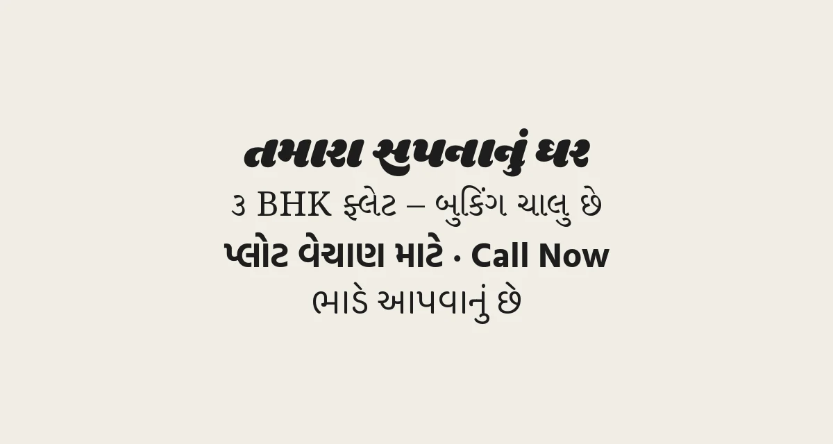
Real estate material is almost always bilingual. Project names, “BHK”, “RERA”, phone numbers and website addresses are usually in Latin letters. Three rules keep it tidy.
- Stay in one family where you can. Each of the fonts above includes Latin letters designed to sit beside its Gujarati, so mixed lines look even without extra work.
- Pair across roles, not randomly. If the Gujarati headline is Shrikhand, set the English subline in a plain sans such as Montserrat or Open Sans rather than another display face.
- Match size by visual weight. Gujarati characters often look smaller than Latin capitals at the same point size. If a bilingual line looks uneven, increase the Gujarati by a point or two instead of shrinking the Latin.
Numbers deserve a decision. Many Gujarati readers are comfortable with Western digits in prices and phone numbers, and Gujarati digits (૦ to ૯) are part of Unicode, but check that your chosen font actually includes them before you commit. Pick one style per piece, and keep phone numbers in the style your audience dials with.
Legibility at small size
Gujarati has no top line like Devanagari, but it has marks above and below the main letter shapes and many conjuncts, such as the combined shapes in ક્ષ and જ્ઞ. Those details close up when text is small, thin or low-contrast.
- Avoid display fonts for anything under headline size, including the legal and contact lines.
- Do not use weights below 300 on phone screens or on printed matter viewed at a distance.
- Give Gujarati more line spacing than Latin. A line height of roughly 1.5 times the font size is a reasonable starting point, since stacked marks need room. This is a rule of thumb, so test it on your layout.
- Keep contrast high on photo backgrounds. Put text on a solid or darkened panel instead of straight over a building render.
- Keep the RERA registration number legible. Registered projects are expected to show it in advertising, so confirm the exact display rules with GujRERA or your legal adviser before you finalise a design.
Bilingual signage, brochures and WhatsApp creatives
Signage and hoardings
Lead with the language your passers-by read first, make the project name the biggest element, and keep the supporting lines to one or two. Export vector artwork or outlined text for the printer so nothing is replaced by a default font. A short, bold display line plus a calm sans for details is more readable at distance than a stack of three decorative fonts.
Brochures and PDFs
Use a serif or sans for body and a display font only for covers and section titles. When you export a PDF, make sure fonts are embedded, so Gujarati conjuncts do not break on someone else’s device. If you design in Canva, you can upload any font file you are licensed to use; our guide on how to upload fonts to Canva walks through it.
WhatsApp creatives
Text typed into a WhatsApp message always appears in the reader’s own system font, so you cannot control it. Anything where the typeface matters, such as a new launch card, a price list or a status image, should go out as an image or PDF made from your design. Keep the image large enough that Gujarati is readable without zooming, and put the contact number in the image and in the message so people can tap and copy it.
Unicode and rendering notes
- Use Unicode Gujarati, not legacy fonts. Modern fonts and software use the Unicode Gujarati block (U+0A80 to U+0AFF). Older non-Unicode fonts used by some print shops store text differently and look like gibberish if the font is missing or when you paste into a web page.
- Conjuncts depend on shaping. The browser, design app or OS must shape the text correctly. Current browsers and major design and office apps generally handle Gujarati, but older or simplified apps may show letters unjoined. If a conjunct looks wrong, test in another app before blaming the font.
- Check the whole message in the output. Export a sample and read every line. A native reader should proofread each creative, since a wrong halant or matra changes the meaning.
- Currency. The rupee sign (₹) is widely supported. Gujarati also has its own rupee sign (U+0AF1), but support varies between fonts, so use ₹ unless you have tested.
For system-level fallback, Windows ships Nirmala UI for Indic scripts and Apple devices include Gujarati fonts, so text still appears if your chosen font is missing. That fallback will not match your design, which is why embedding or exporting as an image matters. If you inherit a flyer and do not know the typeface, our guide to finding a font from an image can help, though Gujarati-specific matches may need checking by eye.
A simple starter combination
- Headline: Shrikhand or Baloo Bhai 2 (for premium, use Noto Serif Gujarati SemiBold).
- Body: Noto Sans Gujarati Regular or Hind Vadodara Regular.
- Numbers and prices: same family in Bold.
- English subline: the same family’s Latin, or Montserrat.
- Fine print: Noto Sans Gujarati Regular, never lighter, and not smaller than you can read on a phone without zooming.
Download from Google Fonts, install, and restart your design software so the font appears. For more ideas on display styles, see our headline fonts.
Frequently asked questions
Which Gujarati font is best for real estate brochures?
Noto Sans Gujarati is the safest all-round choice for body text, and Noto Serif Gujarati or Rasa suit premium projects. Use a bold display face like Shrikhand only for short headlines.
Are these Gujarati fonts free for commercial use?
The families listed here are published on Google Fonts under the SIL Open Font License, which allows commercial use in print, signage and digital creatives. Always read the licence file that comes with a download, and do not assume that fonts on other sites carry the same terms.
Can I use a custom Gujarati font in WhatsApp messages?
No. WhatsApp shows typed text in the reader’s system font. To control the typeface, send your content as an image or PDF.
Why do Gujarati letters break or look wrong in some apps?
Gujarati conjuncts need proper text shaping. Older apps, non-Unicode fonts or missing font files can show unjoined letters. Use a Unicode font, export a test, and embed fonts when sending PDFs.