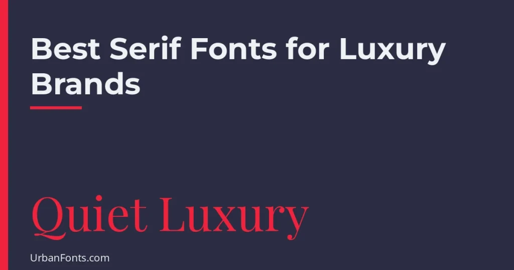
The best serif fonts for luxury brands share a few traits: high stroke contrast, refined proportions and a calm, confident presence. Good free choices include Playfair Display, Cormorant Garamond, Bodoni Moda, Cinzel and Libre Caslon Display on Google Fonts, plus Gambetta and Sentient on Fontshare. This guide compares them, explains why they feel upscale, and shows how to set them so they look expensive rather than dated.
Why serif fonts feel luxurious
Luxury type often borrows from print traditions: fashion magazines, fine stationery, auction catalogs, and the engraved lettering on watches and perfume boxes. High-contrast serifs, with fine hairlines and thick stems, recall that heritage. Wide spacing and large sizes then add the sense of space that people associate with premium products.
That said, plenty of luxury brands have moved to sans serif logos over the years, so a serif is a choice, not a rule. Pick one when you want to signal craft, heritage or editorial polish. If you are still deciding between categories, our post on what a serif font is covers the basics.
Comparison of luxury serif fonts
| Font | Style | Source and license | Suits |
|---|---|---|---|
| Playfair Display | High-contrast transitional, editorial | Google Fonts, OFL | Fashion, beauty, hotels, magazines |
| Cormorant Garamond | Delicate Garamond-style display serif | Google Fonts, OFL | Jewelry, skincare, weddings, large headings |
| Bodoni Moda | Didone with sharp hairlines | Google Fonts, OFL | Fashion houses, perfume, high-end packaging |
| Cinzel | Classical Roman capitals | Google Fonts, OFL | Wine, spirits, monograms, legal and heritage brands |
| Libre Caslon Display | Light, sharp old-style display | Google Fonts, OFL | Boutiques, galleries, editorial covers |
| DM Serif Display | Bold, high-contrast, friendly | Google Fonts, OFL | Restaurants, lifestyle, bold headlines |
| Gambetta | Soft, characterful serif | Fontshare, ITF Free Font License | Boutique brands, editorial, culture |
| Sentient | Contemporary serif, warm and sharp | Fontshare, ITF Free Font License | Modern premium brands, websites |
Google Fonts families are open-licensed, mostly under the SIL Open Font License, which permits commercial use. Fontshare fonts are free for commercial use under the Indian Type Foundry license, but you cannot resell or redistribute the font files, so read the license in the download.
Picks in more detail
Playfair Display
Designed by Claus Eggers Sørensen, Playfair Display draws on 18th-century transitional types. It is the most popular free luxury serif for a reason: it looks elegant at large sizes and comes in several weights plus italics. Keep it for headlines. At small sizes the hairlines become thin on many screens.
Cormorant Garamond
Cormorant, by Christian Thalmann, is a display-oriented Garamond revival with very fine details. Cormorant Garamond is the version with larger counters that many people prefer for headings. Set it large with plenty of space, and avoid the lightest weights for anything smaller than a heading.
Bodoni Moda
This is a Bodoni revival with optical sizing, so the letterforms adapt to the size you use. The sharp contrast reads as fashion and glamour immediately. It needs generous size and careful spacing, because the thin lines vanish on low-resolution output.
Cinzel
Cinzel is inspired by inscriptional Roman capitals. It has capitals plus small capitals that serve as lowercase, so it works best in short strings such as brand names, wine labels or invitations. Use it sparingly. A full paragraph in Cinzel gets tiring to read.
Libre Caslon Display
A fine option for large editorial headings, with a crisp old-style feel. Pair it with Libre Caslon Text for body copy in the same family when you want consistency.
Gambetta and Sentient
Both are available from Fontshare. They feel more contemporary than the classic Didones, which suits premium brands that want to look current. Their license differs from the OFL, so check it first.
How to make serif type look high-end
- Go large and use fewer words. A brand name or short headline in a big size looks confident. Long lines look crowded.
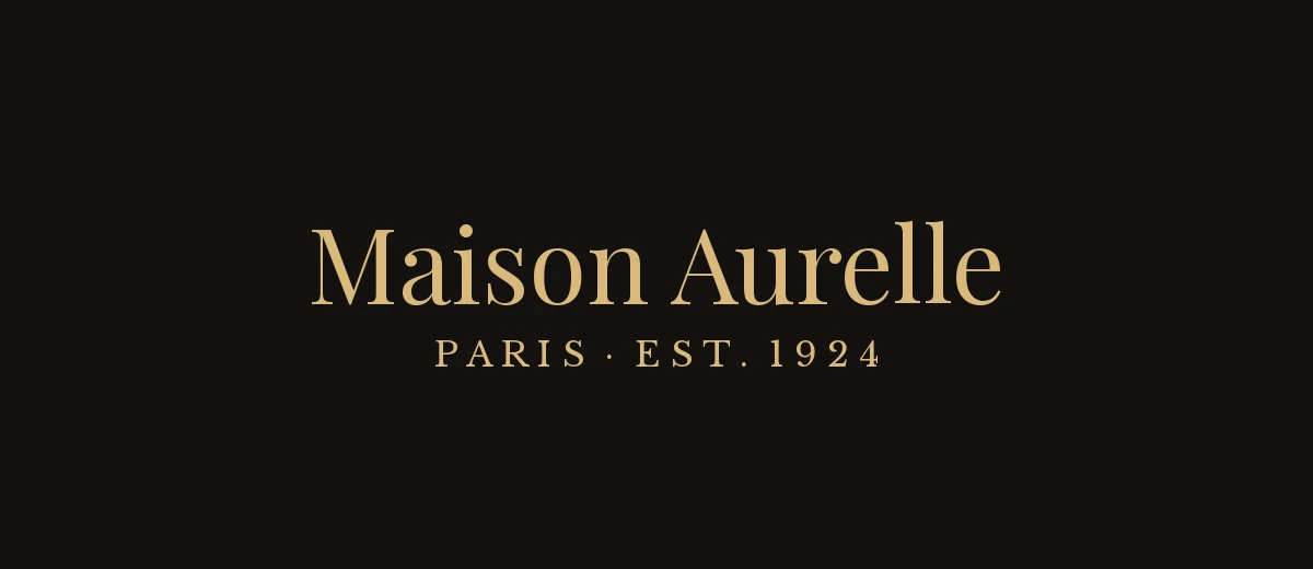
- Add tracking to capitals. Uppercase serif text benefits from extra letter-spacing, roughly 5 to 15 percent. Never track lowercase body text the same way.
- Use a light weight for display, regular for text. Hairline weights suit big headlines only.
- Keep the palette restrained. Black, white, deep neutral colors, and a single accent such as gold or burgundy.
- Leave space. Generous margins are part of the luxury effect.
Pairing a luxury serif
A serif headline works best over a quiet companion. Good partners are a clean sans such as DM Sans or Montserrat for body text, or a light, wide-tracked sans for small labels. Avoid combining two display serifs, since they compete. If you are building a whole identity, our personal branding guide covers how type fits into the rest of the brand, and you can browse elegant fonts and serif fonts for more candidates.
Common mistakes with luxury serifs
- Using hairline weights too small. A Didone looks sharp on a 2-meter sign and disappears in a 12-pixel website footer. Keep fine serifs for large sizes and switch to a sturdier face for small text.
- Stacking many styles. Bold, italic, small caps and a swash all in one headline looks fussy. Choose one emphasis.
- Ignoring the production method. Foil stamping, embossing and letterpress handle fine lines differently. Ask your printer for the minimum line weight they can reproduce, and test a sample before committing a whole run.
- Treating the logo as a typed word. If a brand name is typed in a free font and nothing else, competitors can copy it in seconds. Adjust the spacing, swap a few letters, or add a custom detail so the wordmark is yours.
- Forgetting small-size backups. Many brands keep a main display serif for the logo and a plainer serif or sans for packaging copy, invoices and the website body.
Free versus paid luxury serifs
Free fonts can look excellent, but if everyone uses Playfair Display, it can feel familiar. Many luxury and fashion brands use commissioned or licensed fonts so that their type is unique to them. Paid foundry fonts often offer more weights, optical sizes, ligatures and language coverage, and custom licensing for logos and packaging. For a small brand, a free open-licensed serif set with care is a perfectly sound starting point. Just double-check that the license covers your use, especially for logos or products you will sell.
Which one should you choose?
- Fashion or beauty brand: Bodoni Moda or Playfair Display.
- Jewelry, skincare or wedding business: Cormorant Garamond.
- Wine, spirits or heritage label: Cinzel for the name, with a simple serif for details.
- Boutique or gallery: Libre Caslon Display or Gambetta.
- Modern premium web brand: Sentient with DM Sans.
Frequently asked questions
What is the most luxurious serif font?
High-contrast Didone and transitional serifs such as Bodoni and Playfair Display are the most common luxury signals, especially at large sizes with generous spacing.
Are there free serif fonts that look luxury?
Yes. Playfair Display, Cormorant Garamond, Bodoni Moda, Cinzel and Libre Caslon Display are all free on Google Fonts under the SIL Open Font License, which allows commercial use.
Can I use Playfair Display for a logo?
The SIL Open Font License generally allows use in logos and commercial branding. Because a logo is an important asset, read the license on the Google Fonts page and consider customizing the lettering so it is distinctive.
Should a luxury brand use serif or sans serif?
Either can work. Serifs signal heritage and craft, while light, wide sans serifs signal modern minimalism. Choose based on how you want the brand to feel and keep spacing generous in both cases.