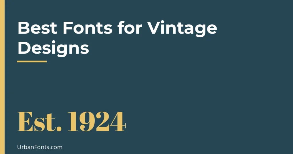
The best fonts for vintage designs depend on which era you want to evoke: fat-face serifs like Abril Fatface and slab serifs like Alfa Slab One for Victorian posters, Limelight and Poiret One for Art Deco, Pacifico and Lobster for mid-century scripts, and Courier Prime for old typewriter text. All of these are free on Google Fonts under open licenses. This guide groups them by era, with a comparison table, and explains how to make a layout feel vintage without looking like a costume.
Pick an era first
“Vintage” covers over a century of design, and the fonts differ a lot. Mixing eras is what makes many “vintage” designs look off. Decide the period, then pick fonts and colors that belong to it. Our vintage fonts and retro fonts pages have more candidates once you know the direction.
| Font | Era or style | Source and license | Suits |
|---|---|---|---|
| Abril Fatface | Victorian fat-face serif | Google Fonts, OFL | Posters, headlines, packaging |
| Alfa Slab One | Heavy slab serif, wood-type feel | Google Fonts, OFL | Shop signs, labels, bold headings |
| Playfair Display | Georgian and Victorian transitional serif | Google Fonts, OFL | Editorial, menus, invitations |
| Old Standard TT | Late 19th-century Modern serif | Google Fonts, OFL | Book-style text, certificates, stationery |
| Rye | Wild West wood type | Google Fonts, OFL | Western themes, saloon-style posters |
| Limelight | Art Deco display | Google Fonts, OFL | 1920s event posters, cinema, cocktail menus |
| Poiret One | Thin Art Deco sans | Google Fonts, OFL | Gatsby-style invitations, elegant labels |
| Pacifico | 1950s casual brush script | Google Fonts, OFL | Diners, surf and retro cafes |
| Lobster | Bold retro script | Google Fonts, OFL | Signage, social posts, retro logos |
| Courier Prime | Typewriter | Google Fonts, OFL | Notes, receipts, screenplays, journals |
Every Google Fonts family is open-licensed, and the ones above are listed with the SIL Open Font License, which allows commercial use. You can confirm each license on the family’s page at Google Fonts before using it.
Victorian and Edwardian: fat faces and slabs
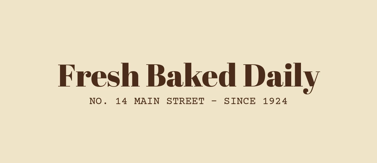
In the 19th century, printers wanted type that grabbed attention on posters and handbills, so they made extremely bold serifs and chunky slabs, many cut in wood. Abril Fatface is a modern interpretation of the “fat face” with huge contrast between thick and thin strokes. Alfa Slab One is a heavy slab with a similar poster energy. Use either at a large size with tight but not touching letters.
For calmer body text from the same period, Old Standard TT is based on late 19th-century “Modern” book types. It has a formal, slightly old-fashioned texture that suits certificates, stationery and period book designs. If you like blackletter for historical looks, see our guide to Old English fonts, but use it sparingly because it is hard to read in long lines.
Art Deco: the 1920s and 1930s
Art Deco lettering is geometric and symmetrical, with thin and thick lines, narrow proportions and strong verticals. Limelight is a display face with that sort of drama. Poiret One is much lighter and thinner, and was influenced by Deco-era lettering. Both are display fonts, so they work best at large sizes for titles, with a plain companion for details. Gold, black, deep green and cream colors strengthen the effect.
Mid-century: the 1940s to the 1960s
Postwar commercial lettering was friendly and energetic: signwriter scripts, bold brush lettering and chunky sans serifs. Pacifico captures the casual sign-painted script of surf shops and diners, and Lobster is a bolder script that grew popular for retro branding. These work well for short phrases. Long sentences in a heavy script quickly become tiring, and all-caps script is almost always a mistake because script capitals were not designed to be strung together.
Typewriter and ephemera
For a worn-document look, use a typewriter face. Courier Prime has been refined for readability and looks cleaner than classic Courier. Google Fonts also offers typewriter-style fonts such as Special Elite, which has a rougher, inked-ribbon look; check the license shown on its page. Typewriter fonts are ideal for labels, tickets, journals and letters. Our look at fonts used in movie posters shows how period styles become tied to particular genres.
How to make a design feel vintage
- Limit the typefaces. Two or three fonts. Vintage printing used what was in the drawer, so a bold display font, a text serif and maybe a script is plenty.
- Use a limited palette. Cream, off-white, brick red, navy, mustard and forest green all read as older print. Pure white and neon do not.
- Use real hierarchy. Vintage posters usually mix sizes boldly, with one large element, one medium and small supporting lines.
- Add small caps and wide tracking. Spaced capitals under a bold title are a classic detail.
- Add texture carefully. A subtle paper grain or slight ink spread suggests print. Heavy distress effects can hurt legibility.
- Keep body text readable. Use a plain text serif, and put the decoration into headings.
Three pairings to start with
| Look | Headline | Supporting text | Palette |
|---|---|---|---|
| Victorian general store | Alfa Slab One | Old Standard TT and Courier Prime for small print | Cream, brick red, black |
| 1920s cocktail night | Limelight | Poiret One in wide-spaced capitals | Black, gold, deep green |
| 1950s diner | Pacifico | A plain bold sans or slab for prices and details | Turquoise, red, cream |
In each case, one font does the shouting and the others keep quiet. If two decorative fonts compete for attention, drop one.
Free versus authentic
Most of the fonts above are revivals or interpretations, not exact copies of historical types. That is a benefit, since they have more characters and better spacing than the originals. If you need an exact historical match for a restoration project or a period film, a paid foundry revival with historical research may be better. Vintage-inspired fonts on other sites can be personal-use only, so check the license before using a decorative font in paid work. You can read how the old types developed in our archive post on vintage typography books.
Which font should you choose?
- Barbershop, bakery or general-store label: Alfa Slab One or Abril Fatface, with Old Standard TT for details.
- 1920s party or cocktail invitation: Limelight or Poiret One.
- Retro diner, surf shop or cafe: Pacifico or Lobster.
- Old documents, journals and tickets: Courier Prime or Special Elite.
- Elegant antique look for stationery: Playfair Display or Old Standard TT.
Frequently asked questions
What is the best font for a vintage logo?
It depends on the era. Abril Fatface or Alfa Slab One suit Victorian and general-store looks, Limelight suits Art Deco, and Pacifico or Lobster suit mid-century retro. Check the license if the logo will be used commercially.
Are vintage fonts free for commercial use?
The Google Fonts examples in this guide are open-licensed under the SIL Open Font License, which allows commercial use. Vintage-style fonts from other sites vary, and many are personal-use only, so check each license.
What fonts look like old typewriter text?
Courier Prime is a clean, readable typewriter font, and Special Elite has a rougher worn-ribbon look. Both are available from Google Fonts.
How do I make a design look vintage?
Choose fonts from one era, use a limited warm palette like cream, red and navy, build bold size contrast, and add a subtle paper texture. Avoid mixing too many styles.