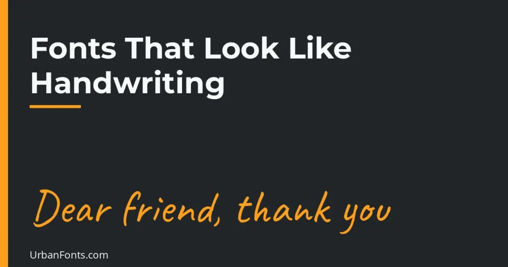
The fonts that look like handwriting fall into two groups: casual print (Patrick Hand, Kalam, Indie Flower, Architects Daughter) and flowing cursive (Cedarville Cursive, Homemade Apple, Caveat). All of the picks below are free Google Fonts families, so you can use them commercially under their open licenses. This guide lists 15, explains how to choose between them, and shows how to make typed text look less mechanical.
What makes a font look handwritten
Handwritten fonts imitate the quirks of a pen: uneven letter heights, a baseline that wobbles slightly, strokes that vary in thickness, and in some cases letters that connect. The more of these quirks a font keeps, the more natural it looks. The less it keeps, the neater and more legible it becomes. That trade-off is the main thing to weigh when you choose.
One limit applies to almost all of them. A typeface draws each letter the same way every time, so a repeated letter looks identical, which gives the trick away in longer text. Short text such as a greeting, quote, or label hides this much better than a paragraph does.
15 free fonts that look like handwriting
| Font | Feel | Good for |
|---|---|---|
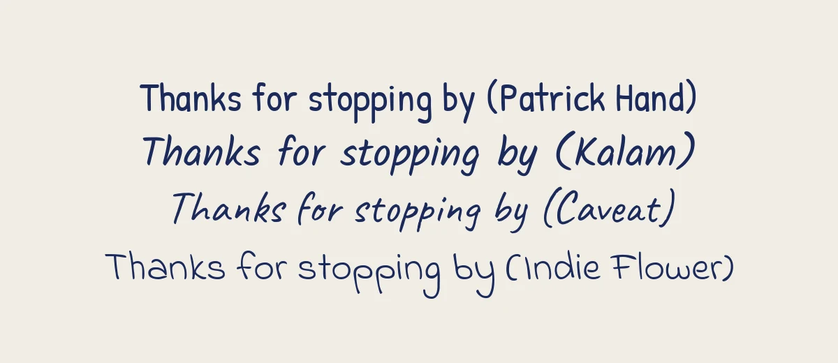
| Patrick Hand | Neat, friendly print | Notes, captions, worksheets |
| Kalam | Natural pen print with slant | Quotes, blog headings |
| Indie Flower | Round, playful | Kids’ materials, cards |
| Architects Daughter | Drafting-style capitals and lowercase | Diagrams, labels, mock notes |
| Shadows Into Light | Thin, light marker | Annotations, light captions |
| Gloria Hallelujah | Loose, bouncy | Informal posts, children’s content |
| Playpen Sans | Friendly handwritten, multiple weights | Educational layouts |
| Schoolbell | Chalk-and-marker classroom feel | Teaching slides, posters |
| Gochi Hand | Casual, rounded | Comics, informal headings |
| Caveat | Fast, semi-cursive note | Margin notes, quote graphics |
| Reenie Beanie | Scratchy, quick scrawl | Post-it style notes |
| Covered By Your Grace | Loose, personal | Journals, scrapbook titles |
| Cedarville Cursive | Joined, connected cursive | Letters, signatures, wedding extras |
| Homemade Apple | Flowing, slanted pen script | Signature-style sign-offs |
| Nanum Pen Script | Brush-pen informality | Short phrases, titles |
All fifteen are on Google Fonts under the OFL or Apache license. Even so, confirm the license on a font’s own page before a large commercial project, since terms on a given family can be updated. Our handwritten fonts collection has more choices beyond Google Fonts.
How to choose between print and cursive
Choose casual print when you need clarity
Print-style fonts like Patrick Hand and Kalam are easier to read at small sizes, work on screens, and are less likely to confuse readers. If the text carries information, such as prices, directions, or a worksheet, start here.
Choose cursive when you want personality
Cedarville Cursive and Homemade Apple look more personal, but joined letters take more effort to read. Use them for a name, a closing line, or a short quote. Do not use all capitals, as cursive capitals are designed to start a word, not to fill it.
Choose marker styles for emphasis
Permanent Marker, Rock Salt, and Caveat Brush are bold marker looks from Google Fonts. They work for headings and stickers but not for body text.
Match the font to the project
| Project | Start with | Why |
|---|---|---|
| Thank-you card or label | Caveat or Kalam | Warm and quick, still easy to read |
| Classroom worksheet or kids’ poster | Patrick Hand, Schoolbell, Playpen Sans | Clear letter shapes at large sizes |
| Wedding sign-off or letter closing | Cedarville Cursive | Joined letters feel personal |
| Mock sticky notes in a design | Reenie Beanie | Scrawled look suits short notes |
| Quote graphic for social media | Kalam, Caveat | Readable on a phone screen |
If you design in Canva, our upload guide helps when a font is not in the list. Whatever you pick, view the final text at the size people will actually see. A cursive font that looks charming on a laptop can turn into a smudge on a small phone screen.
Handwriting-style fonts already on your computer
- Windows: Ink Free, Segoe Print, and Segoe Script are typically included with recent versions.
- macOS and iOS: Bradley Hand, Noteworthy, Marker Felt, and Chalkboard are the usual choices.
- Google Docs and Slides: open the font menu, choose More fonts, and filter by Handwriting.
System fonts may not be present on the device that opens your file, so for documents you share, embed fonts or export to PDF. For Canva work, see our guide to uploading a font to Canva if the one you want is missing from the list.
How to make typed text look handwritten
- Use ink colors. Pure black looks printed. A dark blue like #1b2a5c or a soft charcoal looks like a real pen.
- Add a slight tilt. Rotating a text box by one or two degrees breaks up the perfect horizontal line.
- Keep lines short. Left-align, never justify, and avoid long paragraphs.
- Mix sizes a little. Larger words for emphasis feel more natural than uniform text.
- Put it on paper. A plain cream or lined-paper background does more for the effect than the font itself.
- Do not stack handwriting fonts. Use one for the main note and a plain font for anything formal.
Common mistakes
- Typing a whole page in a script font. Fast reading depends on consistent letter shapes, and scripts disrupt it.
- Using all capitals. Many handwriting fonts have weaker capitals, and capitals remove the shape variation that makes words recognizable.
- Making the text too small. Thin strokes disappear. Go larger than you would with a plain font.
- Using handwriting for formal documents. Resumes, contracts, and invoices need plain fonts. Our guide on what font a resume should be explains the safe choices.
When a font is not enough
A font will never fully match a person’s writing. If you need real handwriting, such as a signature or a family recipe, consider scanning the original. If you want a custom font, a service like Calligraphr can turn a filled-in template into a font file. Pricing and limits change, so check the current terms. Whichever path you choose, remember that a font file made from your handwriting still repeats each letter, so text will look more mechanical than the page you started with.
If you only need decorative text for a social bio or message, the Unicode styles in our cursive font copy and paste guide are not real fonts, but they work in places where you cannot install anything. For a related styling approach, see our collection of script fonts or learn how to find a font from an image if you spotted handwriting you like.
Frequently asked questions
What is the best font that looks like handwriting?
For a neat, readable result, try Patrick Hand or Kalam. For a loose, quick-note look, try Caveat. For flowing cursive, try Cedarville Cursive or Homemade Apple. The best one depends on whether you want print-style letters or joined script.
Are handwriting fonts free for commercial use?
The Google Fonts families named in this article are licensed under the SIL Open Font License or the Apache License, which allow commercial use. For any font from another source, read the license on the download page, because many handwriting fonts are free for personal use only.
Why does my handwriting font look fake?
Because the same letter always draws the same way. Real handwriting varies slightly every time. You can soften the effect by using a slightly smaller size, an ink-like color, a small tilt, and a textured paper background, or by choosing a font that includes OpenType alternates.
Are there handwriting-style fonts built into Windows and Mac?
Yes. Windows typically includes Ink Free, Segoe Print, and Segoe Script. macOS includes fonts such as Bradley Hand, Noteworthy, and Marker Felt. The exact set depends on your version, so check your font list.
Can I turn my own handwriting into a font?
Yes. Online services such as Calligraphr let you fill in a template, scan or photograph it, and generate a font file. Features and pricing change, so check the current plan before you start.