The best modern Arabic geometric fonts for branding are Cairo, Tajawal, IBM Plex Sans Arabic, Noto Kufi Arabic, Readex Pro, Almarai, and Reem Kufi. All of them are free on Google Fonts under the SIL Open Font License, which allows commercial use, including in logos and packaging. Below you will find what each one is good for, how to pair its Latin letters for a bilingual brand, and the Arabic-specific settings that make a brand look polished instead of pasted together.
What “geometric” means for Arabic type
In Latin type, geometric sans fonts are built from circles and straight lines, like Futura or Montserrat. Arabic has a different structure, because its letters come from calligraphy. A “geometric” Arabic font usually means three things: low stroke contrast, even curves and straight verticals, and simplified joins. Many designers also call Kufic-based fonts geometric, since Kufic is the most angular of the classical styles.
Good modern Arabic fonts still follow calligraphic rules for letter proportions and dot placement. Tajawal’s description, for example, says it follows a modern geometric style while respecting the calligraphy rules of the Arabic script. That balance is what keeps text readable.
Fonts to consider, with verified details
I checked each family against its Google Fonts metadata and description. All are listed under the OFL.
| Font | Character | Weights | Variable? | Includes Latin? |
|---|---|---|---|---|
| Cairo | Based on the Kufi style; open counters, short ascenders and descenders | 200 to 1000 | Yes (weight and slant) | Yes, extended from Titillium Web |
| Tajawal | Low-contrast, modern geometric | 7 weights | No | Yes |
| IBM Plex Sans Arabic | Neutral, friendly grotesque; corporate feel | 7 weights | No | Yes, and it pairs with IBM Plex Sans |
| Noto Kufi Arabic | Simplified, unmodulated Kufi; suited to larger sizes | 100 to 900 | Yes (weight) | Limited, so pair with a separate Latin font |
| Readex Pro | Clean, readable sans with an extra extension axis | 160 to 700 | Yes (weight and expansion) | Yes |
| Almarai | Geometric look on a calligraphic structure | 4 weights | No | Yes |
| Reem Kufi | Kufic, based on early models; a distinctive heritage-modern feel | 400 to 700 | Yes (weight) | Yes, Latin by Santiago Orozco |
| El Messiri | Curvy, brush-drawn feel; less geometric | 400 to 700 | Yes (weight) | Yes |
| Rubik | Slightly rounded corners | 300 to 900 | Yes (weight) | Yes |
| Changa | Compact, with short ascenders and descenders | 200 to 800 | Yes (weight) | Yes |
Two things to note from that table. First, El Messiri is not geometric: its description says it was drawn as if with a brush and inspired by Naskh. It works for a warmer or more literary brand, so I included it for contrast. Second, a “Yes” under variable means one file covers the weight range on Google Fonts. Variable fonts store a whole range of weights in one file, which is handy on the web but not supported everywhere (see the Canva note at the end).
Which one fits which brand
Tech, finance, and corporate
IBM Plex Sans Arabic and Readex Pro are the safest choices. Both are neutral, readable at small sizes, and they behave well in dashboards and documents. Tajawal and Almarai are lighter and slightly warmer, which suits fintech apps and service brands.
Retail, food, and lifestyle
Cairo is the practical all-rounder, with weights that run from thin to very heavy, so one family can cover headlines, buttons, and body text. Rubik adds friendliness with its rounded corners. Changa has a compact look that works for packaging and menus.
Cultural, hospitality, and heritage-modern
Reem Kufi and Noto Kufi Arabic bring Kufic structure into a modern setting. They look strong in logos, titles, and signage, but they are not ideal for long paragraphs. Use a calmer sans such as Tajawal for body copy and let the Kufic font carry the headline.
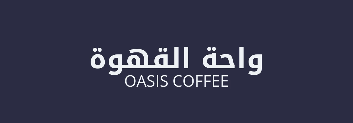
Pairing with Latin type for a bilingual brand
Most Arabic brands also need English, French, or another Latin-script language. There are two ways to handle it.
- Use the Latin built into the Arabic family. Cairo, Tajawal, Almarai, Readex Pro, Rubik, and Reem Kufi all include Latin letters, so the two scripts share weight and tone automatically. This is the fastest route to a consistent result.
- Pair two fonts. When the Latin built into an Arabic family is not what you want (Noto Kufi Arabic has only limited Latin coverage, for example), choose a Latin sans with similar stroke contrast. Montserrat, Poppins, DM Sans, Inter, and IBM Plex Sans are all OFL options. Match the weights by eye, not by number, because a Regular in one family can look lighter than a Regular in another.
Optical size matters too. Arabic letters often look smaller than Latin letters at the same point size, so you may need to set Arabic text a little larger. Put both lines side by side at the size you will actually use and adjust until they look equal. If your brand uses a serif Latin font, try serif fonts with Naskh-based Arabic instead of a geometric sans. For clean, spare looks, browse our minimalist fonts.
Setup rules that make Arabic branding look professional
- No letter spacing. Tracking separates letters that should connect. Add space with size or line height.
- Increase line height. Arabic has marks above and below the line. A line height of around 1.5 to 1.8 is a common starting point for body text, so test it with your font.
- Pick a numeral style on purpose. Arabic fonts can show Western numerals (0 to 9) or Eastern Arabic-Indic numerals. Choose by audience and market, and use the same style everywhere in the brand.
- Mirror layouts for right-to-left. A bilingual layout is not just translated text. Logos with arrows, progress bars, and icons that imply direction may need a mirrored version.
- Build a lockup for each language. Design the Arabic logo as its own version, not a translation set beneath the English one. Keep clear space and alignment equal.
- Check the whole character set. Make sure the font supports every character you need, including the diacritics and any languages beyond Arabic, such as Persian or Urdu letters.
- Have a native reader proof every file. Mistakes in joined letters change meaning.
Licensing and logos
The OFL lets you use these fonts commercially, including in logos, print, apps, and websites. You cannot sell the font files by themselves, and modified versions have rules about the font name. Because anyone can download the same fonts, a logo set in Cairo will look like other logos in Cairo. For a brand you want to own, ask a designer to customise the letterforms or draw a bespoke wordmark, and keep a readable font like Tajawal for everything else. Our personal branding guide covers how fonts fit into a wider identity.
Getting the fonts into your tools
On Google Fonts you can open each family page and download it, or use the embed code for a website. Check the Arabic subset is included when you add them to a site. For Canva, you can upload TTF or OTF files to a Brand Kit on a paid plan, as explained in our guide on how to upload a font to Canva. Canva does not support variable fonts, so use static font files for Cairo, Noto Kufi Arabic, and other variable families. More families are on our Arabic fonts page, and you can also filter by Arabic on Google Fonts.
Frequently asked questions
Which Arabic font is best for a modern logo?
Cairo, Tajawal, Noto Kufi Arabic, and Reem Kufi are common choices, because they have clean forms and strong weights. Remember that anyone can use the same free fonts, so consider customising the lettering if the logo needs to be unique.
Are these Arabic fonts free for commercial use?
Yes. Cairo, Tajawal, IBM Plex Sans Arabic, Noto Kufi Arabic, Readex Pro, Almarai, Reem Kufi, El Messiri, Rubik, and Changa are all listed under the SIL Open Font License on Google Fonts. You can use them in logos and products, but you cannot sell the font files on their own.
Which Arabic fonts include matching Latin letters?
Cairo, Tajawal, Almarai, Readex Pro, Rubik, Reem Kufi, El Messiri, and Changa all include Latin glyphs. Noto Kufi Arabic is better paired with a separate Latin font such as Montserrat or Inter.
Is Reem Kufi geometric?
It is a Kufic design based on early Kufic models and the Fatimid Kufic grid, so it is angular and geometric in feel. It suits titles and logos better than long text.
Can I use Arabic variable fonts in Canva?
Canva’s help page says it does not support variable fonts. Cairo and Noto Kufi Arabic are variable on Google Fonts, so upload static files if you want to use them in a Brand Kit.