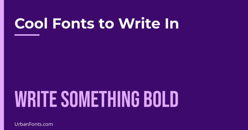
The best cool fonts to write in are the ones that match the feeling of your text: Special Elite for a typewriter mood, Great Vibes for romantic script, Pirata One for blackletter drama, and Bebas Neue for loud poster lines. This guide groups free picks by mood and shows how to use them in journals, posters, and creative writing without making the page hard to read. It is about expressive fonts for personal and creative projects. For everyday documents and notes, a plain serif or sans-serif is usually the better choice, and the sections below show how to combine the two.
How to choose a cool font
Ask three questions before you pick: how long is the text, who will read it, and where will it appear? A single title can carry a bold display font. A page of journal entries needs something calmer. A poster needs contrast and distance legibility. If you are unsure, use the cool font for headings and pair it with a plain body font.
Every font named below is a Google Fonts family under an open license (SIL OFL or Apache 2.0), so you can use them in personal and commercial work. You can browse them at Google Fonts.
Cool fonts by mood
| Mood | Fonts to try | Best for |
|---|---|---|
| Typewriter, vintage | Special Elite, Courier Prime | Journals, short stories, scripts, old-letter looks |
| Blackletter, gothic | UnifrakturCook, Pirata One | Dark fantasy titles, band names, tattoo-style lettering |
| Elegant script | Great Vibes, Allura | Invitations, poems, quotes |
| Bouncy retro script | Pacifico, Lobster | Cafe signs, summer posters, food posts |
| Brush and marker | Permanent Marker, Caveat Brush | Notebook covers, sticker-style titles |
| Poster headline | Bebas Neue, Anton, Abril Fatface | Posters, banners, social media covers |
| Retro and futuristic | Righteous, Monoton, Bungee | Gaming posts, music events, synth-wave looks |
| Fantasy and spooky | Cinzel Decorative, Uncial Antiqua, Creepster, Metal Mania | Story titles, Halloween, game maps |
| Pixel and arcade | Press Start 2P, VT323, Silkscreen | Retro game themes, tech-inspired layouts |
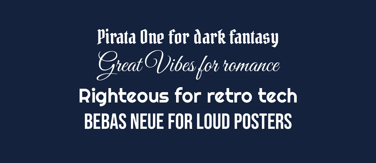
Typewriter and vintage
Special Elite imitates worn typewriter type, with uneven ink and slightly rough edges. It is excellent for a journal entry that should look like a found note. Courier Prime is cleaner and more regular. It is based on the Courier look used for screenplays, so it is a natural choice if you are drafting a script. Both are monospaced, so letters take equal width, which gives the page a steady rhythm.
Blackletter and fantasy
UnifrakturCook and Pirata One are blackletter styles with the heavy strokes of medieval lettering. Pirata One is somewhat easier to read. Cinzel Decorative brings Roman capitals with ornamental flourishes, which suits fantasy and historical titles. Uncial Antiqua mimics rounded manuscript hands. Use these for titles of a few words. Blackletter in all capitals is very hard to read, so write the title in normal upper and lower case. Our gothic fonts collection has more options in this style.
Script and brush
Great Vibes and Allura are formal, flowing scripts good for names, vows, and quotations. Pacifico and Lobster are heavier and more casual; they look best on a bold background. Permanent Marker and Caveat Brush give the look of a quick marker, which suits cover titles and labels. Keep scripts to a short line and give them space. For more, browse script fonts and calligraphy fonts.
Poster and headline fonts
Bebas Neue and Anton are condensed, tall sans-serifs that read from a distance. Abril Fatface is a heavy, high-contrast serif with a fashion-magazine feel. For all of them, fewer words is better. A poster headline of three to six words in a bold face, with a smaller supporting line in a simple font, almost always looks good. See more in headline fonts.
Retro, futuristic, and pixel
Righteous has rounded, geometric shapes that look like 1970s signage. Monoton is a multi-line neon style that is only readable at large sizes and in short words. Bungee is a chunky display font designed for signs. Press Start 2P, VT323, and Silkscreen are pixel and terminal-style fonts. They look sharpest at the sizes they were designed for; in other sizes, pixel edges can blur.
How to apply a cool font well
For a journal or notebook page
- Choose one cool font for dates and headings and a plain, readable font for entries.
- Keep entries at 11 to 12 pt with generous line spacing.
- Use color sparingly: one accent for headings is plenty.
For a poster or cover
- Put the cool font on the main message only.
- Increase contrast between text and background. White on dark and black on a pale color are both safe.
- Leave empty space around the headline so the shapes are visible.
- Check the layout from a few steps back, or shrink it on screen, to see whether the headline still reads.
For creative writing
If you write stories or poems, a typewriter font in a plain word processor can help you commit to a draft because the look discourages fussing over formatting. Save the decorative title font for the cover page or chapter openings. If you are submitting to an editor or contest, check their formatting rules first; many ask for a plain font such as Times New Roman or Courier at 12 pt.
Combinations to copy
| Project | Cool font (title) | Plain partner (text) |
|---|---|---|
| Typewriter-style journal | Special Elite | Courier Prime |
| Fantasy story cover | Cinzel Decorative | Lora or Merriweather |
| Wedding or poem card | Great Vibes | Montserrat |
| Gig or sale poster | Bebas Neue | Open Sans |
| Retro game night flyer | Press Start 2P (short words only) | Roboto or Open Sans |
The logic is the same in each row: the cool font gets one job, and the partner stays quiet so readers can finish the sentence. If you want to try a combination, set both at their real sizes before deciding, because a font that looks great at 90 pt can fall apart at 14 pt.
Where you can use them
- Google Docs and Slides: open the font menu and choose More fonts. Many of the fonts above are available there.
- Canva: search the font name in the dropdown. If a font is missing, see how to upload a font to Canva.
- Word, Pages, and photo editors: download the font from Google Fonts and install it on your computer.
- Bios and chats: platforms that do not let you choose a font may support Unicode text styles. Read cute font copy and paste for how that works and where it breaks.
A few cautions
Decorative fonts trade legibility for personality, so test them on the people who will read them. Avoid long text in all capitals, avoid putting two decorative fonts on one page, and check accessibility: low contrast and thin strokes are hard for many readers. If a font is not from Google Fonts or another clearly open source, read its license before using it in anything you sell.
Frequently asked questions
What are cool fonts to write in?
It depends on the mood. Special Elite gives a typewriter feel, Great Vibes and Pacifico bring script flair, Bebas Neue and Anton suit bold poster lines, and UnifrakturCook adds a blackletter look. Pick the one that matches what you are writing, then keep the rest of the page simple.
Can I use cool fonts for long paragraphs?
Rarely. Decorative fonts are designed for short stretches such as titles, quotes, and labels. For paragraphs, use a plain serif or sans-serif and let the cool font handle the headline.
Are these fonts free for commercial use?
The fonts named in this article are from Google Fonts and are released under the SIL Open Font License or the Apache License, both of which allow commercial use. For any other font, check the license on its download page.
How do I use a cool font in Google Docs?
Open the font menu in the toolbar and choose More fonts. Search for the name, add it, and it will appear in your font list. Google Docs only offers fonts from its own library, so a font that is not there cannot be used unless you work in another program.
Is copy and paste text the same as a font?
No. Copy-and-paste styles are Unicode characters that look like fonts, and they only work where the platform shows those characters. Real fonts need to be installed or available in the app. Our copy-and-paste guides explain the differences.