The best fonts for web design are readable, fast to load and legally safe to embed: Inter, Open Sans, Roboto, Lato, Source Sans 3, Lora, Merriweather and Playfair Display are all dependable choices, and all are available free through Google Fonts. This guide explains what to look for, which fonts work for which kinds of sites, and how to load them without slowing the page down.
What makes a font good for the web?
- Legibility on screens. Look for a generous x-height, open letter shapes and clear differences between characters such as I, l and 1.
- A useful range of weights. Regular, medium, semibold and bold cover most layouts. Variable fonts can supply all of these in a single file.
- Language support. If your audience writes in Cyrillic, Greek, Vietnamese or other scripts, check that the font includes them.
- A license that allows web embedding. Open-licensed fonts (OFL, Apache) do. For paid fonts you usually need a web license, which is often priced by monthly page views.
- File size. Every extra weight, style and character set adds to download time.
Best sans serif fonts for websites
| Font | Character | Suits |
|---|---|---|
| Inter | Neutral, very legible at small sizes | Web apps, SaaS, documentation |
| Open Sans | Friendly, wide, familiar | Blogs, news, general content sites |
| Roboto | Neutral with slight geometric feel | Material-style interfaces, Android-flavored products |
| Lato | Warm, semi-rounded | Small business and service sites |
| Source Sans 3 | Compact, humanist | Text-heavy sites, dashboards |
| Montserrat | Wide geometric, strong headlines | Marketing pages, agencies |
| Poppins | Round geometric, bold weights | Startups, landing pages, apps |
| Nunito | Rounded terminals, soft | Education, family, wellness brands |
Inter, Open Sans, Lato, Source Sans 3, Montserrat, Poppins and Nunito are published under the SIL Open Font License on Google Fonts. Roboto has been distributed under open licenses too (historically Apache 2.0), so check the current license shown on its Google Fonts page before assuming either one. Google also lists the license on every font page.
Best serif fonts for websites
Serifs give a site a more editorial or established feel, and they hold up well on modern high-resolution displays.
| Font | Character | Suits |
|---|---|---|
| Lora | Calligraphic, balanced, good for reading | Blogs, magazines, long articles |
| Merriweather | Sturdy, wide, designed for screens | News, publishing, documentation |
| Playfair Display | High contrast, elegant headings | Fashion, hospitality, portfolios |
| Source Serif 4 | Clean transitional serif | Reports, longform, product sites |
Playfair Display is best kept to large headings. Its thin strokes get fragile at body size. For reading text, Lora, Merriweather and Source Serif 4 are safer. Our what is a serif font post covers the differences if you are deciding between categories.
System fonts: the fastest option
A system font stack uses whatever font the visitor’s device already has, so there is nothing to download. A common stack is system-ui, -apple-system, "Segoe UI", Roboto, sans-serif. On Apple devices that resolves to San Francisco, on Windows to Segoe UI, and on many Android devices to Roboto. The trade-off is that your site looks slightly different on each platform. For many text-focused sites that is a fair price for zero font loading. See what font Apple uses for how San Francisco came about.
How to pair fonts on a website
- Use two families at most. One for headings, one for body, or just one family in different weights.
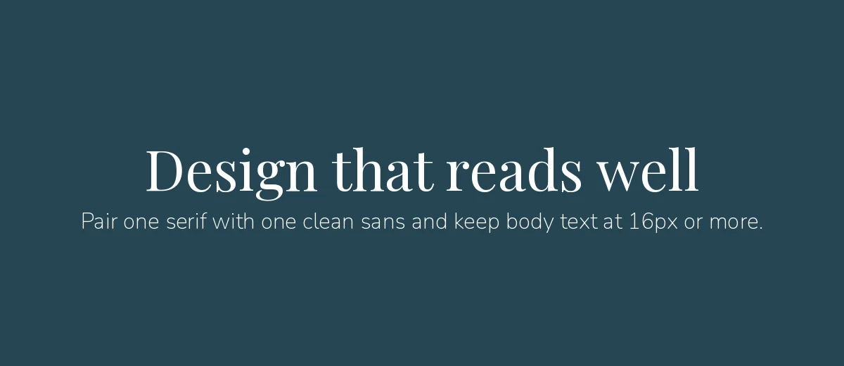
- Contrast, don’t clash. A serif heading with a sans body (Playfair Display with Source Sans 3) or the reverse is a classic approach.
- Keep body text at 16px or larger. Smaller text strains many readers on mobile.
- Use a line height of about 1.5 for paragraphs, with lines of roughly 50 to 75 characters.
- Test at real sizes on a phone. A font that looks refined on a large monitor may be thin and faint on a small one.
Loading fonts without slowing your site
- Load only what you use. Each weight and italic is a separate file unless you use a variable font. Ask for the weights you need, not the whole family.
- Use WOFF2. It is the compressed web format supported by current browsers.
- Set
font-display: swap. This shows fallback text immediately and swaps in your font when it arrives. See the MDN reference on font-display for the options. - Choose a close fallback. If your fallback has similar proportions, the layout will shift less when the web font loads.
- Consider self-hosting. Downloading the font files and serving them from your own site avoids a third-party request. This also matters for privacy: a 2022 court ruling in Munich fined a site operator for sending visitors’ IP addresses to Google through a hotlinked Google Font, and many European sites now self-host. If this concerns you, get legal advice for your situation.
Google’s own guide to optimizing web font loading is a good technical follow-up.
Readability and accessibility checks
Beautiful type that people cannot read is a failure. Before you sign off on a font choice, run through these checks:
- Color contrast. The WCAG guidelines call for a contrast ratio of at least 4.5:1 for normal body text. Thin weights in light gray rarely pass.
- Ambiguous characters. Type “Il1 O0 rn m” in the font. If capital I, lowercase l and the numeral 1 look alike, avoid it for interfaces where people read codes, names or passwords.
- Italic and bold availability. If a family has no real italic, browsers synthesize a slanted version that looks distorted. Choose families with the styles you need or avoid italics.
- Zoom and text resize. Use relative units such as rem for font sizes so people who increase their browser’s default text size get what they ask for.
- Numbers. For prices and tables, look for tabular figures, where every digit has the same width so columns line up. Inter and Source Sans 3 both offer them through OpenType features.
Decorative display fonts can help a hero headline but should never carry navigation, buttons or paragraphs. Treat them as an accent, and keep the reading experience in a plain, well-spaced text face.
Free versus paid web fonts
Google Fonts and similar libraries cover most needs, and their open licenses let you use fonts commercially. Paid fonts make sense when a brand wants something distinctive that is not everywhere, or needs unusual weights and language support. When you buy, confirm that the license covers web embedding (often sold as a “webfont” or “web license”) and check any traffic limits. For desktop and print design you can also browse the UrbanFonts library, but always confirm the license of any font before using it on a site.
Which font should you pick?
- Blog or magazine: Lora or Merriweather for body, with Montserrat or Inter for headings.
- SaaS or web app: Inter, Source Sans 3 or Roboto.
- Business or portfolio site: Poppins, Lato or Open Sans.
- Fashion, restaurant or hotel: Playfair Display for headings with a clean sans for body.
- Kids, education, wellness: Nunito for a softer feel.
Frequently asked questions
What is the best font for a website?
There is no single best, but Inter, Open Sans, Roboto and Lato are dependable for body text because they are legible at small sizes and render well on most screens. Pick based on your audience and brand tone.
What font size should I use for web body text?
Aim for at least 16px for body text, with a line height around 1.5. Smaller sizes are harder to read on phones and for many older readers.
Are Google Fonts free for commercial websites?
Yes. Every family on Google Fonts is open-licensed, mostly under the SIL Open Font License, so you can use them on commercial sites. The license for each family is shown on its Google Fonts page.
How many fonts should a website use?
Two families is a sensible limit: one for headings and one for body text. Many good sites use only one family in multiple weights, which also keeps pages faster.