The closest Google Fonts alternatives for the Kinfolk serif font are EB Garamond and Cormorant Garamond for the classic, calm look, Newsreader or Fraunces for a warmer editorial feel, and Libre Caslon Display or Instrument Serif for large headlines. All of them are free for commercial use under the SIL Open Font License. No single Google font is an exact match, because Kinfolk has changed its typefaces over the years and its current type is custom.
Here is what we could verify about Kinfolk’s type, followed by alternatives chosen for the traits that give the magazine its quiet, slow-living look.
What typeface does Kinfolk actually use?
There is no single answer, and some popular claims online are repeated without sources. These are the points we could trace to named sources:
- 2015 redesign. In a January 2015 interview with It’s Nice That about the redesign of Issue 14, then creative director Charlotte Heal called Garamond “the company’s brand typeface”, kept it for some body copy, and said the other typefaces were replaced. She also commissioned Abi Huynh to rework the logo.
- Typefaces in that era. A Fonts In Use entry for Issue 15 lists Garamond, Avenir, Fortescue, Twentieth Century, Swift and Optimus Princeps. A reader comment on the same page says the logo is based on Optimus Princeps, redrawn for the website. Treat the logo detail as secondary, because it comes from a comment, not a statement by the magazine.
- 2017. The D&AD entry for Issue 23 mentions a new display serif designed to feel elegant and timeless, but does not name it.
- 2021 redesign. It’s Nice That reported that for its tenth anniversary Kinfolk moved to custom typefaces by the foundry Schick Toikka, working with design director Alex Hunting. The family has text, deck and display serif cuts with italics, plus a companion sans. The serifs are described as wedge-shaped, with small flared details and many alternate uppercase ligatures for headlines.
- Retail fonts on one project. Klim Type Foundry’s showcase page for the Alex Hunting Studio design lists Domaine Text and Feijoa. The page does not date the work, so we cannot say which issues or years it covers.
We could not verify which font the Kinfolk website uses today, and we found no sign that the custom family is sold to the public. If you need the exact typeface for a project, check the current printed issue or ask the magazine, and do not rely on lookalike “Kinfolk font” downloads, which are unrelated fonts that borrow the name.
What gives the Kinfolk look
Whatever the exact typeface, the look comes from a few traits you can reproduce:
- A refined serif with sharp, slightly wedge-like terminals and moderate to high contrast.
- Light, generous letter spacing on small uppercase labels.
- Large type used sparingly, with a lot of white space around it.
- A quiet sans serif for captions and details.
- Italics for emphasis and pull quotes, rather than bold.
Google Fonts alternatives compared
| Font | Designer | Character | Best for |
|---|---|---|---|
| EB Garamond | Georg Duffner, Octavio Pardo | Garamond revival, calm and bookish | Body text, long reads |
| Cormorant Garamond | Christian Thalmann | Delicate, high-contrast Garamond style | Large headings, quotes |
| Newsreader | Production Type | Editorial text face with optical sizes | Articles and newsletters |
| Fraunces | Undercase Type, Phaedra Charles, Flavia Zimbardi | Soft, old-style, variable with a quirk axis | Warm brand headlines |
| Libre Caslon Display | Impallari Type | Sharp, high-contrast display serif | Big covers and titles |
| Instrument Serif | Rodrigo Fuenzalida, Jordan Egstad | Condensed display serif with italic | Short statement headlines |
The designers and licences above come from the Google Fonts records. Each family is under the SIL Open Font License. The look descriptions are our own judgment, and none of these is an official substitute for the Kinfolk typeface.
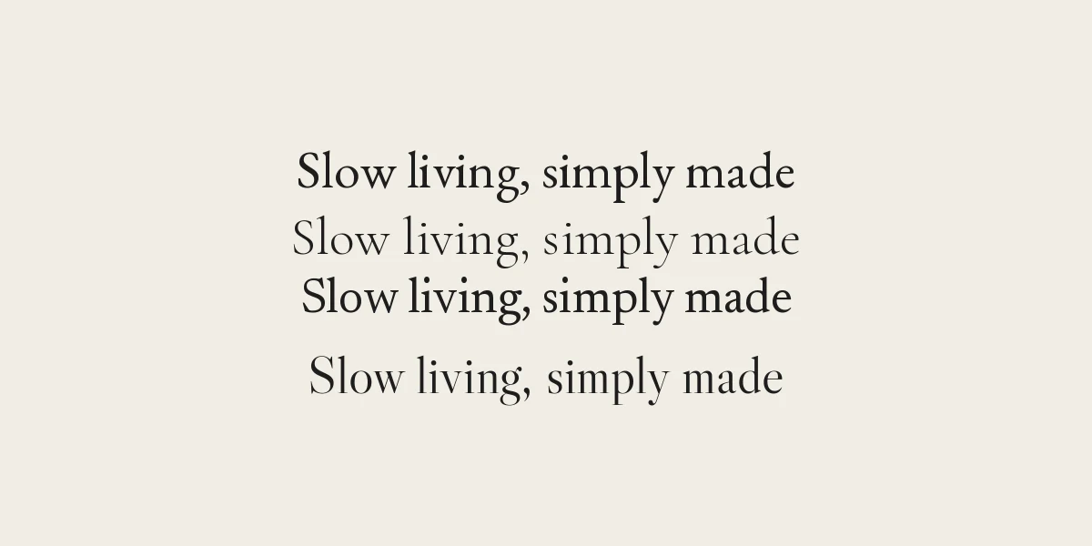
Which one to choose
EB Garamond for the Garamond connection
Because Garamond is the typeface Kinfolk’s former creative director named in 2015, EB Garamond is the most defensible match if you want that direction. It works for body copy and is rich in OpenType features, such as small capitals and ligatures. Check the specimen page for the full list before you rely on a feature in your app.
Cormorant Garamond for elegant headlines
Cormorant Garamond is lighter and more delicate, with long, sharp details. It looks excellent at large sizes and poorly at tiny ones, so use it for headlines and pull quotes and keep the body in a sturdier face such as EB Garamond or Newsreader.
Newsreader for long reads
Newsreader is a text face with an optical size axis, which adjusts the design to the size you use. It gives a calm, editorial voice that suits blogs, newsletters and long interviews.
Fraunces for warmth
Fraunces is softer and more characterful. It is a variable font with axes for softness and a “wonk” setting that changes some letterforms. It suits lifestyle brands that want a friendly feel rather than a strict one. Keep the quirks low if you want a restrained Kinfolk mood.
Libre Caslon Display and Instrument Serif for statements
Libre Caslon Display is sharp and high in contrast, built for large sizes. Instrument Serif is narrow and works for short headlines with its matching italic. Use them for one or two lines, not paragraphs.
Pairing and settings
- Add a quiet sans. Pair the serif with a neutral sans such as DM Sans or Inter for captions, menus and buttons. Both are on Google Fonts under the OFL.
- Use small, spaced uppercase labels. Set category labels in the sans at small size with extra letter spacing, roughly 5 to 10 percent, to echo editorial layouts. That range is a starting point, so adjust by eye.
- Give body text room. Line height around 1.5 to 1.7 times the font size keeps a light serif readable.
- Use italics, not bold. Reserve italic for emphasis and quotes. A restrained palette of two or three weights is enough.
- Limit sizes. One large headline size, one body size and one small label size will look more editorial than many in-between sizes.
If you are building a brand around this style, our personal branding guide covers how to choose and document your fonts, and the post on what a serif font is explains the terms used above. To use these fonts in Canva, follow our steps for uploading fonts to Canva. You can also browse more options in our elegant fonts and minimalist fonts.
A note on licences and trademarks
Using a similar typeface is ordinary design practice. Copying a publication’s logo or passing off your work as theirs is different, and a logo is usually protected as a trademark. Use these fonts for your own identity. Download them from Google Fonts, where each family page shows its licence, and keep a copy of the licence file with your project.
Frequently asked questions
What font does Kinfolk use?
It has changed. Kinfolk’s creative director called Garamond the brand typeface in 2015, and in 2021 the magazine introduced custom typefaces by Schick Toikka. We could not verify which font its website uses today.
What is the best free alternative to the Kinfolk serif?
EB Garamond for body text and Cormorant Garamond for headlines are the closest matches to the earlier Garamond direction. Newsreader and Fraunces suit a warmer editorial feel.
Is there a Kinfolk font I can download?
We found no sign that the custom family is sold to the public. Fonts named Kinfolk or Kinsfolk on font sites are unrelated and do not show what the magazine uses.
Are these Google Fonts free for commercial use?
Yes. EB Garamond, Cormorant Garamond, Newsreader, Fraunces, Libre Caslon Display and Instrument Serif are under the SIL Open Font License, which allows commercial use. Read the licence file in your download to be sure.