The easiest Canva fonts that go together follow one pattern: a distinctive heading font plus a plain, readable body font. Playfair Display with Montserrat, Lora with Open Sans, and Bebas Neue with Lato are good starting points, and all of them are Google Fonts families. Below are nine pairings, why each works, and the rules that let you build your own. A note first: Canva updates its font library, so confirm each name appears in the font dropdown on your account before you commit to a design.
The rules behind every good pairing
- Contrast on purpose. Pair fonts that look clearly different, such as a serif with a sans-serif. Two fonts that are nearly the same read as an accident.
- One personality font at most. If the heading is decorative (a script, a heavy display face), keep the body font neutral.
- Match the mood, not just the shape. A formal serif and a casual rounded sans pull in different directions.
- Look at proportions. Fonts with similar letter heights sit more comfortably together on a line.
- Build hierarchy with size and weight. A heading around two to three times the body size, with the body in regular weight, is a sturdy default.
Google’s own guide to pairing fonts makes similar points and is worth a read if you want the theory.
Nine pairings you can try in Canva
| Heading | Body | Mood | Good for |
|---|---|---|---|
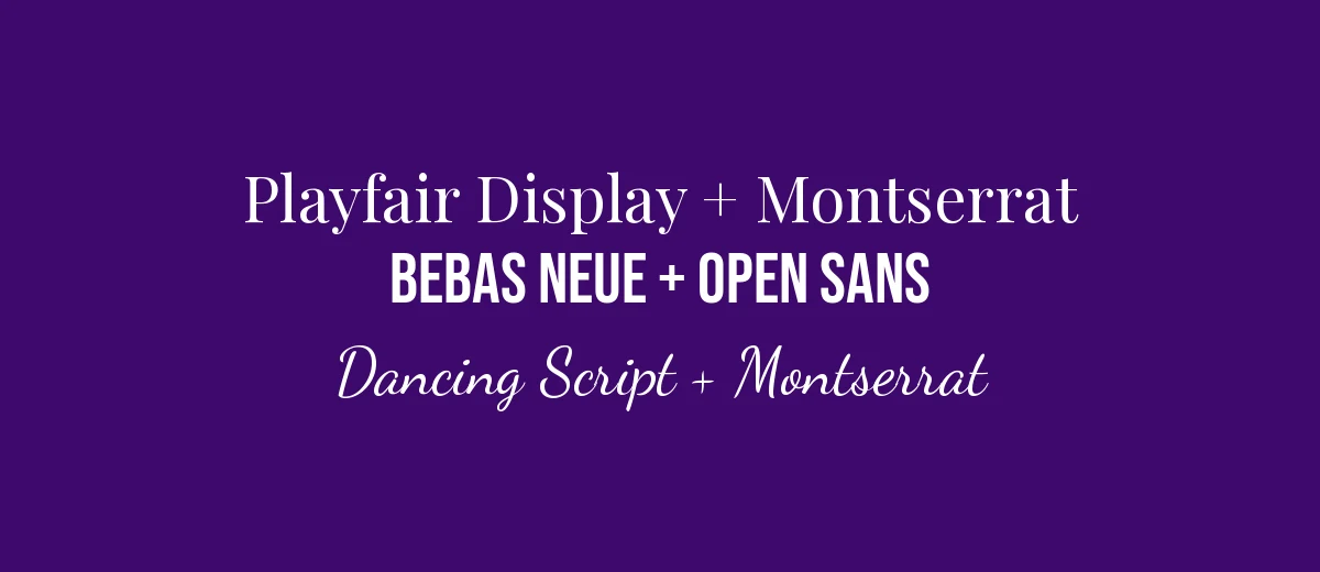
| Playfair Display | Montserrat | Elegant, modern | Invitations, boutiques, quote posts |
| Lora | Open Sans | Warm, trustworthy | Blog graphics, newsletters, ebooks |
| Bebas Neue | Lato | Bold, clean | Posters, event flyers, YouTube thumbnails |
| Abril Fatface | Poppins | Punchy, fashion-like | Social media covers, lookbooks |
| Merriweather | Source Sans 3 | Readable, editorial | Reports, long documents, education |
| Dancing Script | Montserrat | Friendly, personal | Greeting cards, bakery or salon posts |
| Oswald | Open Sans | Strong, practical | Sale announcements, sports, fitness |
| Cormorant Garamond | Raleway | Light, refined | Weddings, spas, luxury brand decks |
| DM Serif Display | DM Sans | Calm, editorial | Menus, portfolios, pitch decks |
Every font in this table is a Google Fonts family released under an open license (OFL or Apache), and each is listed on Google Fonts. Canva carries many Google Fonts families, but it does not carry everything, and the library changes. Treat the table as a shortlist to search for, not a guarantee.
Why these pairings work
Serif heading plus sans body
Playfair Display, Lora, Merriweather, and Cormorant Garamond are serifs with enough character to carry a headline. Playfair Display and Cormorant Garamond have fine, high-contrast strokes, so they suit larger sizes and an elegant feel. Lora and Merriweather are sturdier and more readable at medium sizes. Their partners, Montserrat, Open Sans, Source Sans 3, and Raleway, are plain sans-serifs that stay out of the way. If you want to understand the category better, read what is a serif font.
Condensed or display heading plus neutral body
Bebas Neue and Oswald are tall, narrow sans-serifs, so they fit a lot of impact into a short line. Bebas Neue is all capitals, which is fine for two or three words but tiring in a sentence. Pair them with a round, open font like Lato or Open Sans for the information below. Abril Fatface is a heavy, fat-face serif; Poppins gives it a geometric counterweight that keeps the layout from feeling cluttered.
Script heading plus sans body
Dancing Script adds warmth and movement, so use it for a name, a greeting, or one emphasized phrase and then switch to a straightforward sans like Montserrat for everything else. Do not set body copy in a script, and avoid all caps in script fonts because many scripts look awkward without lowercase letters. For more options, see our script fonts.
Same-family or sibling pairings
DM Serif Display and DM Sans were designed by the same foundry as a suite, which is why they feel related. Using fonts that share a designer is a reliable shortcut, because the proportions and finishing already agree. Search both names in Canva and test them at your real sizes.
How to apply a pairing in Canva
- Click a text box and open the font dropdown in the top toolbar.
- Type the exact name of your heading font and select it.
- Click the body text and pick the second font. Use the weights available in the dropdown or the style options in the toolbar.
- Set sizes. Try a heading near 48 to 72 pt on a poster or slide and body between 16 and 24 pt, then adjust to the design size.
- Use Copy style (the paintbrush icon in the toolbar) to apply the same look to other text boxes quickly.
Canva also offers pre-built text combinations in the Text tab and tools for changing fonts across a design, but names and placement change between versions, so rely on the font dropdown if you cannot find them. If you work on a team or run a brand, set your two fonts once in the Brand Kit (Brand Hub) so every design starts with the right choices; the steps are in our guide to uploading a font to Canva.
Check readability before you export
A pairing that looks good on a large monitor can fail on a phone. Zoom the canvas out to about the size of a phone screen and see whether the body text is still legible. Check text color against the background: dark text on light, or the reverse, is safest, and mid-grey on a photo is a common failure. For printed items, keep body text at 10 pt or larger unless you have tested a proof. Light script weights and thin high-contrast serifs are the first fonts to disappear at small sizes, so keep them for headings.
Common mistakes
- Using three or four fonts. It breaks the hierarchy. Pick two and use size, weight, and color for the rest.
- Setting a light font on a photo. Thin weights vanish on busy backgrounds. Choose a heavier weight or add a solid overlay.
- Ignoring alignment and spacing. Fonts that go together still need consistent margins and line spacing.
- Pairing two decorative fonts. A script with a stencil, for example, makes the message harder to read.
- Using bold or italic on fonts that lack them. Faux bold distorts letter shapes. Choose a font family with real weights.
When you have a font you love
If you already have a favorite heading font and need a partner, the quickest method is to pick a neutral sans such as Open Sans, Lato, or Montserrat and test it. If you are unsure what an image uses, our guide on how to find a font from an image can help you identify it, and the font library lists many families for comparison. Save two or three combinations in a draft design, view them side by side at the size you will actually publish, and choose the one that reads best.
Frequently asked questions
How many fonts should I use in one Canva design?
Two is the safe number: one for headings and one for body text. A third can work as a small accent, such as a script for a single word, but more than three usually looks unplanned.
Does Canva suggest font pairings for me?
Yes. The Text tab in the editor has ready-made text combinations, and Canva’s style and brand tools can apply a matched set of fonts across a design. The names and layout of these panels change over time, so look for the closest equivalent in your version.
Can I pair two serif fonts or two sans-serif fonts?
You can, but it is harder. If both fonts are in the same category, make sure they differ clearly in weight, width, or size. Two similar serifs that are almost the same look like a mistake rather than a choice.
Are all these fonts free to use commercially?
The fonts in the table below are Google Fonts families under open licenses, which allow commercial use. Canva also has its own licensing terms for its library, so for client work check Canva’s terms and the license of any font you upload.
What if a font from my pairing is not in Canva?
Search by exact name in the font dropdown first. If it is missing, choose a similar alternative from the same category, or upload the font if your plan allows it. Our guide to uploading fonts to Canva covers the steps.