Technical
Bad Microsoft Word Typography
From the company that popularized Arial, here are three examples of bad typography in Microsoft Word. Bad typesetting in Word finds its…
Read more →From the company that popularized Arial, here are three examples of bad typography in Microsoft Word. Bad typesetting in Word finds its…
Read more →Yes all designers HATE Times New Roman, but let’s face it- on the web we are very limited on what fonts we…
Read more →We’re seeing change in font use and designs in Web 2.0, but these changes aren’t just aesthetic but functional too. So I…
Read more →We have become an increasingly visual society in the years since the advent of television in the 1950s. If other web advertisers…
Read more →When Linotype acquired the Helvetica family it was in disarray - two different names for the same version, variations in design features.…
Read more →Better known today for being Apple’s main font on their website, iPod and more, Myriad is a humanist sans-serif typeface designed by…
Read more →Ugly fonts, cutesy fonts, unreadable fonts, bad fonts . . . they have terrorized us for far too long, infiltrating our homes……
Read more →Apple and Microsoft have always disagreed in how to display fonts on computer displays. Today, both companies are using sub-pixel rendering to…
Read more →It has now been 50 years since Helvetica was introduced. Even if you’ve never heard its name before, you would be bound…
Read more →There is a new wicked typography website that allows designers to submit an original design using a font of their choice for…
Read more →Free fontsNew fontsTop 100Our favoritesFree dingbatsPremium fonts
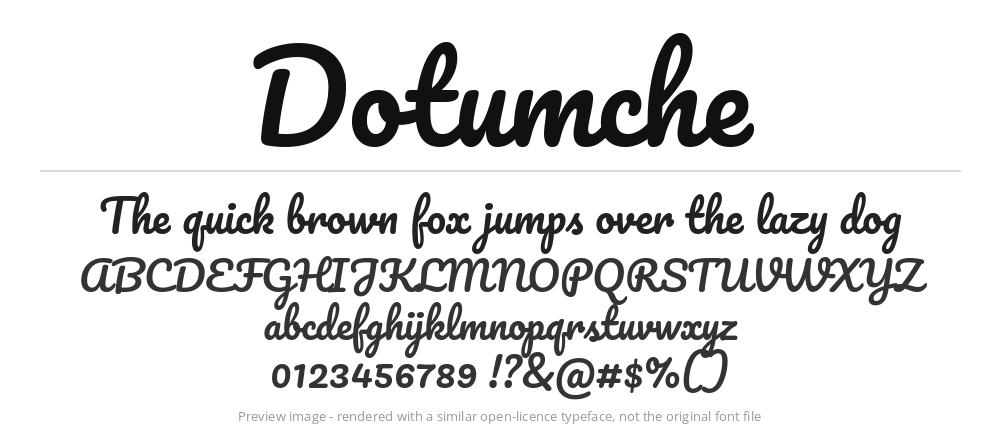 Dotumche
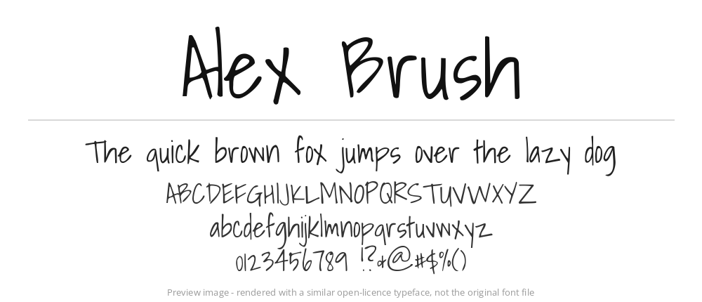 Alex Brush
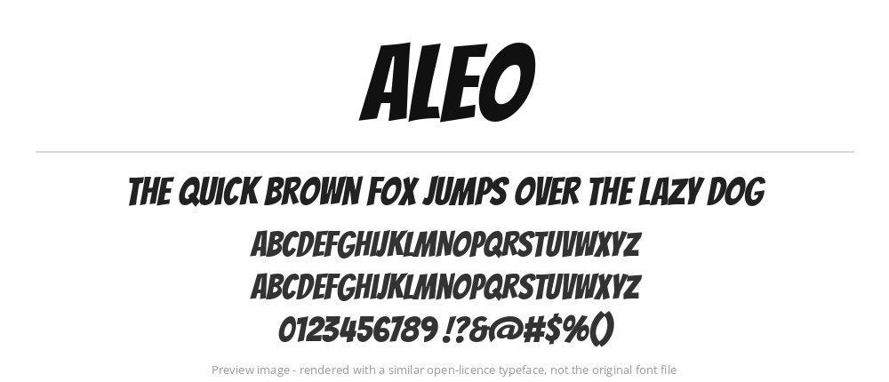 Aleo
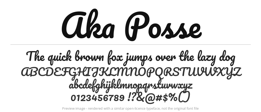 Aka Posse
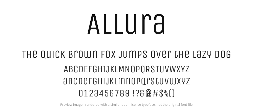 Allura
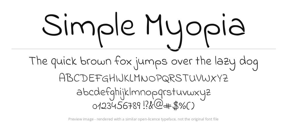 Simple Myopia