- Arabic
- Asian
- Cartoon
- Celtic
- Christmas
- Comic
- Decorative
- Destroy
- Display
- Distorted
- Easter
- Eroded
- Fire & Ice
- Fixed width
- Futuristic
- Gothic
- Graffiti
- Grid
- Groovy
- Halloween
- Horror
- Initials
- LCD
- Medieval
- Mexican
- Modern
- Old School
- Pixel / Bitmap
- Retro
- Roman-Greek
- Russian
- Sans serif
- School
- Sci-fi
- Script
- Serif
- Square
- Stencil
- Trash
- Typewriter
- Valentine
- Western
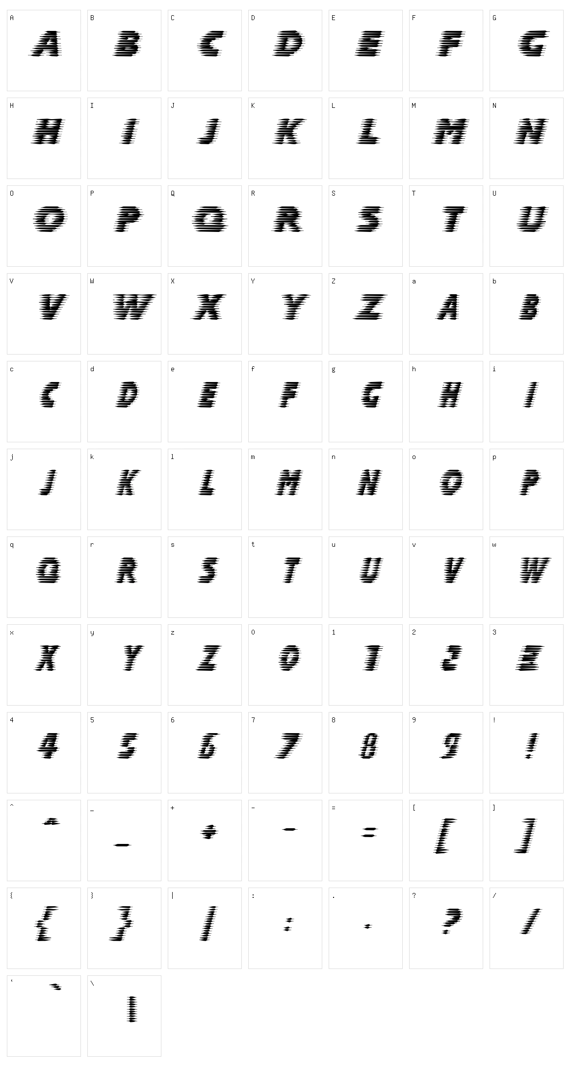
Halcion
Designed by:
Apostrophic Labs
Category:
Various
File size:
137.92 kb
Description:
The free font Halcion is carefully designed by Apostrophic Labs, showcasing a thoughtful balance of creativity and usability and falls under the Various font style. When you download the ZIP file, it contains only 137.92 KB of font files, making it lightweight and quick to download. Please review the license details below to understand permitted usage and distribution rights. If license information is not available, we recommend using this font for personal projects only or contacting the author directly for commercial usage permissions.
License:
Character Set