Last Three Weeks in Type #21
Games that help you learn the history of typography, beer coasters designed as conversation pieces, typography to help people understand dyslexia, hand-made typography projects, fonts that kill designs, and more in today’s round-up. Sophisticated fonts and creative restlessness run through these past couple of weeks. Take a closer look:
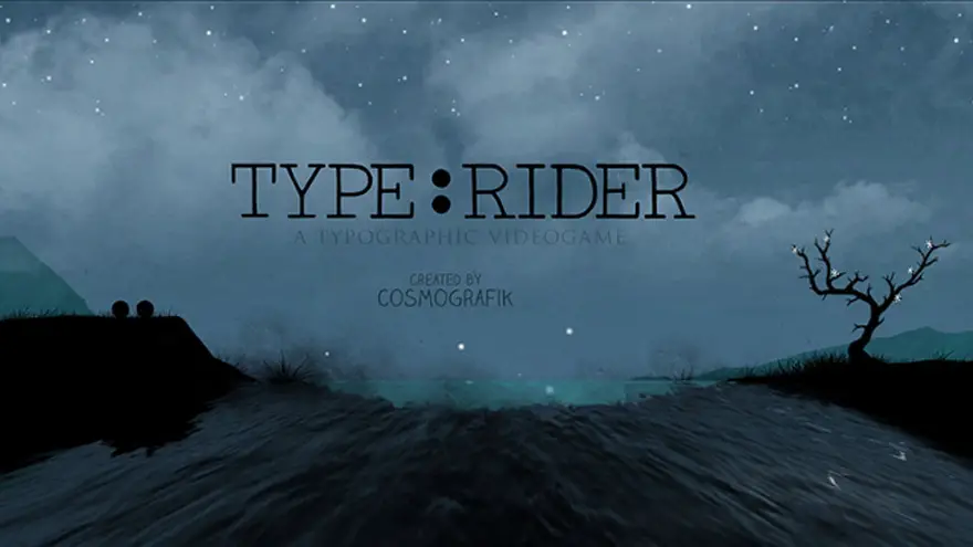
Learn the History of Typography Through Type:Rider
Even if you’re one of those ‘font fanatics’ who knows Gary Hustwit’s Helvetica by heart, you’ll still learn something while playing Type:Rider. Not to mention that it comes with lots of fun on the side. Available for iOS and Android, the game guides players through the history of typography as two dots travelling over different font characters, solving riddles and unlocking the history behind typefaces. The app is a clean-cut ode to the more attentive and beautiful side of typography. Once the player has explored all of the game’s ten worlds, the power-up pages come together to form an e-book for future reference. Fingers crossed!
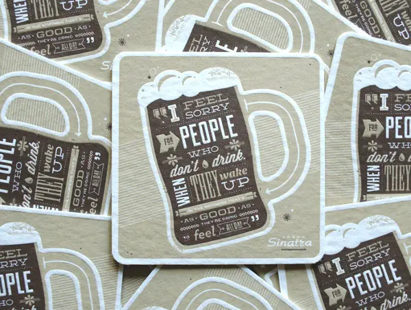
For Lovers Of Beer And Typography: ‘Beer Press’ Coasters
This is a good example of someone combining four passions – design, typography, letterpress and beer – into one product: ‘Beer Press’ coasters. These six drink coasters are also sleekly designed conversation pieces. Each coaster is imprinted with a different typographic beer-related design, and delicately handcrafted by a vintage 1960s letterpress. It surely adds a new dimension to the banal ‘having a beer’. Cheers!
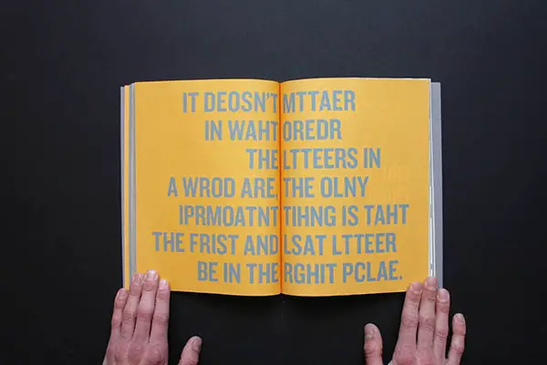
Graphic Designer Uses Beautiful Typography To Help People Understand Dyslexia
Ever wondered what’s it like to be dyslexic? You can find out by reading this book. Using stylish typography, graphic designer Sam Barclay forms passages from the book ‘The Small Pleasures of Life’ to express how a dyslexic person would struggle with reading. Have a look!
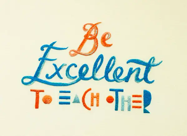
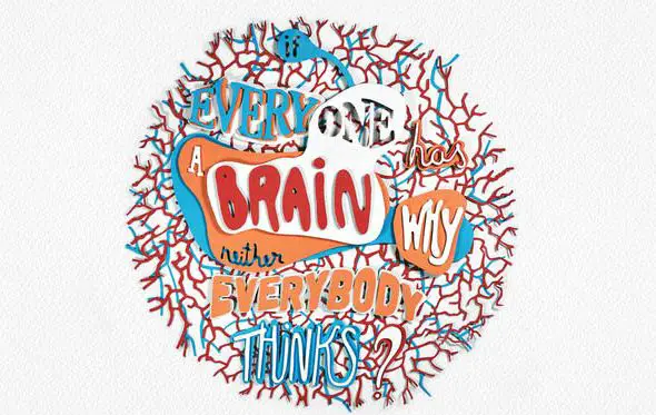
Handmade Typography Projects That Will Inspire You
It’s always a pleasure to see artists combining analog and digital workflows, isn’t it? The imperfect lines created by a designer’s hands lends a certain uniqueness to a project. While the digital workflows an artist employs provides a level of polish and control, allowing a project to have a truly professional and deliberate look. In this post you’ll get to see some great hand-made typographic projects. Enjoy!
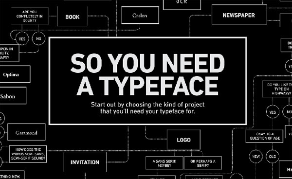
Fonts that Kill Designs – Typography Mistakes to Avoid
This article tries to identify some of the common typography mistakes designers make in the font selection process. It even goes through the methodology of selecting fonts. In the sea of fonts out there, this set of tips comes quite handy.
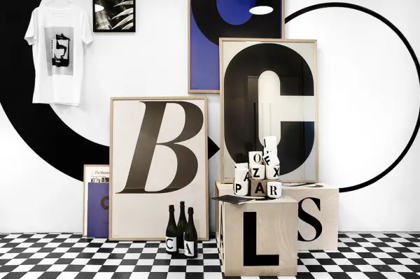
Playtype Typography Posters
This Danish concept store has an impressive collection of posters and other various products devoted to all things in the matter of printed letters and words. Check out how some typefaces are turned into bonafide works of art. It must be love. For typography, of course.
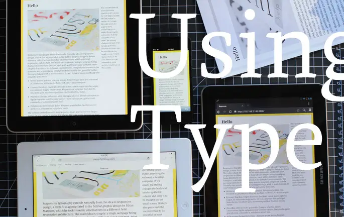
Doing Responsive Typography
Responsive typography makes it possible to serve typographic compositions that adapt to fit their various environments, resizing, reflowing as necessary to best serve the reader, whether they’re viewing the content on a phone, a cathode ray tube, a large display, in print, or something in between. In this article, a simple example of responsive typography is taken apart to see how it actually works. Exploration never hurt anyone. Go for it!
